Angular Alert Popup Example: Customizable Alerts in Apps
Alerts play a crucial role in capturing the user's attention, especially when prompt actions are required. They should provide concise and clear information about the situation, along with actionable options. This tutorial focuses on constructing a versatile and adaptable alert module in Angular, enhancing the overall user experience.
This Angular alert module features three distinct alert variations. Developers have the flexibility to tailor the alert’s colors, heading, and body by providing the necessary input parameters. Offering reusability and customization, this module can be integrated into any Angular application, allowing its usage throughout the entire application.
- Explore this beginner’s guide for Angular application development to grasp the fundamentals of Angular.
Angular Alert Variations
This alert module encompasses three variations: Success Alert, Error Alert, and Warning Alert. To achieve these variations, developers can customize the module’s behavior by handling specific parameters tailored to each type.
- Success Alert
- Error Alert
- Warning Alert
Alert Parameters
The alert module provides a flexible and dynamic way to customize alerts based on specific parameters. The “title” parameter allows you to set a string as the title for the alert modal, providing a concise heading. The “type” parameter, accepting values like “success,” “danger,” and “info,” determines the visual style of the alert, allowing for differentiating between success messages, error alerts, and informational notifications. The “time” parameter, represented by a numerical value, defines the timeout for the alert, ensuring it disappears after a specified duration. Lastly, the “body” parameter is designed for a string input, offering a detailed information section within the alert modal for a comprehensive user experience.
- title: The title is a string that represents the title of the alert modal.
- type: The type is a string representing the alert modal type. Supported values are
success,dangerandinfo. - time: The time is a number that represents the timeout value of the alert modal.
- body: The body is a string that represents the detailed info displayed in the alert modal.
You can see the variations of alerts below.
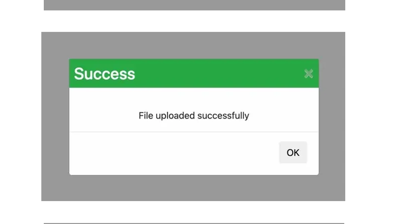 Customizable Alerts in Angular
- This Angular project has already been upgraded to Angular 14.
App Prerequisites
Before proceeding with the application setup, ensure that your development environment meets the specified prerequisites. The application relies on specific versions of Node, NPM, and Angular CLI for compatibility. Make sure to have Angular CLI version 12.0.0, Node version v18.12.1, and npm version 14.2.10 installed on your system. These versions are crucial for maintaining a consistent and stable development environment. If you need to install or update any of these tools, you can use the provided version information as a reference to ensure compatibility with the application’s requirements.
Angular CLI: 12.0.0
Node: v18.12.1
Package Manager: npm 14.2.10

Package                         Version
---------------------------------------------------------
@angular-devkit/architect       0.1402.10
@angular-devkit/build-angular   14.2.10
@angular-devkit/core            14.2.10
@angular-devkit/schematics      14.2.10
@angular/cli                    14.2.10
@schematics/angular             14.2.10
rxjs                            6.6.7
typescript                      4.6.4
To initiate our Angular project, let’s begin by creating a new Angular project. If you’re not acquainted with this process, you can refer to this starter guide for step-by-step instructions. Throughout the development journey, we’ll leverage Angular CLI, a powerful tool that automates various manual tasks, streamlining the project setup. Additionally, to enhance the visual appeal and ensure mobile responsiveness, we’ll incorporate the Bootstrap frontend framework into our web components. This combination of Angular CLI and Bootstrap will contribute to a more efficient and visually appealing development experience.
Create an Angular project
To kick off our project, the initial step involves creating a fresh Angular project using Angular CLI. Navigate to your desired directory, open the terminal, and execute the command ng new test-project. This straightforward command triggers the installation of a pristine Angular application within the designated directory, laying the foundation for our project.
Install Bootstrap in Angular
As previously highlighted, our chosen stylish framework is Bootstrap. To integrate Bootstrap with Angular, we’ve opted for a straightforward approach: embedding the Bootstrap CDN directly into the index.html file. Open the index.html file and append the Bootstrap CDN. This ensures that the associated CSS file is loaded as the application springs to life in the browser.
<link rel="stylesheet" href="https://maxcdn.bootstrapcdn.com/bootstrap/4.0.0/css/bootstrap.min.css" integrity="sha384-Gn5384xqQ1aoWXA+058RXPxPg6fy4IWvTNh0E263XmFcJlSAwiGgFAW/dAiS6JXm" crossorigin="anonymous">
Create an Angular Alert Popup module
In this step, we embark on crafting the Angular alert module, a reusable gem that will adorn our entire Angular application. The sequence of commands below generates the module, component, service, and interface, subsequently updating the nearest Angular module for seamless integration.
ng g m shared/modules/alert
ng g c shared/modules/alert
ng g s shared/modules/alert/services/alert
ng g interface shared/modules/alert/interfaces/alert
With these commands executed, we now possess the essential files and folders. The next step of our journey involves enriching each of these components with the designated content.
Update Angular Alert Popup Component
The alert.component.ts file reigns orchestrating every move of alerts. Here, we craft a dynamic variables: title, type, time, body, and backColor, to give birth to alert modals on the fly. The alertResEvent property takes center stage, sending responses back to the nurturing parent through events, empowering it to shape decisions based on these alert responses. To infuse life into our alert modal, we use animation, using the CSS scale3d() function.
- Dive deeper into the enchanting world of Angular animation for an immersive experience.
alert.component.ts
import { Component, OnInit, Output, EventEmitter } from '@angular/core';
import { trigger, transition, style, animate } from '@angular/animations';
import { AlertService } from './services/alert.service';
import { Alert } from './interfaces/alert';

@Component({
    selector: 'app-alert',
    templateUrl: './alert.component.html',
    styleUrls: ['./alert.component.scss'],
    animations: [
        trigger('dialog', [
            transition('void => *', [
                style({ transform: 'scale3d(.3, .3, .3)' }),
                animate(100)
            ]),
            transition('void => *',
                animate(100, style({ transform: 'scale3d(.3, .3, .3)' })))
        ])
    ]
})
export class AlertComponent implements OnInit {

    //hide and show alert
    modalStatus!: boolean;

    //custom settings
    title!: string;
    type!: string;
    time!: number;
    body!: string;

    //default settings
    backColor!: string;

    @Output() alertResEvent = new EventEmitter<boolean>();

    constructor(
        private alertService: AlertService,
    ) { }

    ngOnInit() {
        this.alertService.alertSettings$.subscribe(
            (data: Alert) => {
                this.title = data.title;
                this.type = data.type;
                this.time = data.time;
                this.body = data.body

                if (this.type == "danger") {
                    this.backColor = "#dc3545";
                }
                if (this.type == "info") {
                    this.backColor = "#a1930f";
                }
                if (this.type == "success") {
                    this.backColor = "#28a745";
                }
                //show alert
                this.modalStatus = true;
            }
        );
    }

    //close alert after click on ok and cross
    resolve(res: boolean) {
        this.modalStatus = false;
        this.alertResEvent.emit(res);
    }
}
alert.component.html
<div id="myModal" class="modal" *ngIf="modalStatus">
<div class="modal-content" [@dialog]>
<div class="header" [style.background-color]="backColor">
<h3>{{title}}</h3>
<span class="close" (click)="resolve(false)">×</span>
</div>
<div class="body">
<p>{{body}}</p>
<hr>
</div>
<div class="footer">
<span class="footer-btn">
<button class="btn btn-default cancel-btn" (click)="resolve(false)">Cancel</button>
<button class="btn btn-default" [style.background-color]="backColor" (click)="resolve(true)">OK</button>
</span>
</div>
</div>
</div>
alert.component.scss
.modal {
  display: block;
  position: fixed;
  z-index: 1031;
  left: 0;
  top: 0;
  width: 100%;
  height: 100%;
  overflow: auto;
  background-color: rgb(0, 0, 0);
  background-color: rgba(0, 0, 0, 0.4);
}

.modal-content {
  background-color: #fefefe;
  margin: 15% auto;
  padding: 0px;
  border: 1px solid #888;
  width: 30%;
}

.btn-default {
  margin-right: 2px;
  color: white;
}

.cancel-btn {
  color: black;
}

.close {
  color: #aaa;
  float: right;
  font-size: 28px;
  font-weight: bold;
  padding-top: 0.5rem;
  padding-right: 0.5rem;
}

.header {
  background-color: #bd2130;
}

.close:hover,
.close:focus {
  color: black;
  text-decoration: none;
  cursor: pointer;
}

.body {
  text-align: center;
  padding-top: 2.2rem;
}

.footer-btn {
  float: right;
  padding-bottom: 20px;
  padding-right: 20px;
}

h3 {
  float: left;
  padding-top: 0.5rem;
  padding-left: 0.5rem;
  color: #fff;
}
Update Angular Alert Popup Service
Within the alert service, the pivotal player is the alertSettings subject. The alert component eagerly subscribes to this subject, anticipating the forthcoming configurations from users. As the create() method welcomes fresh alert configurations, the alert modal undergoes a transformation, updating itself and embracing the influx of new data.
alert.service.ts
import { Injectable } from '@angular/core';
import { Subject } from 'rxjs';

//this is alert-emit interface
import { Alert } from '../interfaces/alert';

@Injectable()
export class AlertService {

    alertSettings$ = new Subject<Alert>();

    constructor() { }

    create(
        title: string, type: string, time: number, body: string) {
        this.alertSettings$.next({
            title,
            type,
            time,
            body
        });
    }
}
Update Angular Alert Popup Interface
In refining the alert interface, we meticulously outline the properties that define the alert module. This interface serves as the guardian, ensuring the alert entity maintains uniformity across the entire application.
interface/alert.ts
export interface Alert {
    title: string;
    type: string;
    time: number;
    body: string;
}
Create test component
To test the Angular alert module, we’ll initiate the creation of a test component using the command ng g c test. This command generates the essential files: test.component.ts, test.component.html, and test.component.scss.
In the test.component.ts file, we’ll introduce a boolean variable, alertResponse, to capture responses from the alert module. By employing the create() function in the alert service, we’ll provide configurations that dynamically generate alerts within the module. Additionally, the getAlertRes() method will be invoked upon the user’s interaction with the Cancel or Ok buttons in the Angular alert. To complete this setup, we’ll include the
test.component.ts
import { Component, OnInit } from '@angular/core';
import { AlertService } from '../shared/modules/alert/services/alert.service';
@Component({
    selector: 'app-test',
    templateUrl: './test.component.html',
    styleUrls: ['./test.component.scss']
})
export class TestComponent implements OnInit {

    alertResponse: boolean = false;

    constructor(private alertService: AlertService) { }

    ngOnInit() { }

    successAlert(): void {
        this.alertService.create(
            "Success", //title
            "success", //type: success, danger, info
            5000, // time
            "Connection success" //body
        );
    }

    warningAlert(): void {
        this.alertService.create(
            "Warning", //title
            "info", //type: success, danger, info
            5000, // time
            "Connection is slower than usual" //body
        );
    }

    failedAlert(): void {
        this.alertService.create(
            "Failed", //title
            "danger", //type: success, danger, info
            5000, // time
            "Connection failed" //body
        );
    }

    getAlertRes(res: boolean): void {
        this.alertResponse = res;
    }
}
test.component.html
We will use the
<app-alert (alertResEvent)="getAlertRes($event)"></app-alert>
<div id="container">
  <div>
    <button class="btn btn-success" (click)="successAlert()">Success</button>
  </div>
  <div>
    <button class="btn btn-warning" (click)="warningAlert()">Warning</button>
  </div>
  <div>
    <button class="btn btn-danger" (click)="failedAlert()">Failed</button>
  </div>
  <p>{{alertResponse}}</p>
</div>
test.component.scss
#container {
  display: flex;
  flex-direction: row;
  flex-wrap: nowrap;
  justify-content: center;
}

#container>div {
  width: 100px;
  height: 100px;
}
Test Angular Alert Popup Example
To verify the functionality of our Angular alert module, execute the application using the command ng serve -o in the terminal. After launching, visit localhost:4200 in your browser to witness the diverse variations of our Angular alert module in action. For a comprehensive look at the complete code, refer to the repository.
Conclusion
In conclusion, the implementation of consistent and user-friendly alert components is crucial for an effective web application. Our journey led us to develop a versatile alert module in Angular, offering reusability and customization. This module stands as a reliable solution, ensuring uniform and dynamic alerts across various sections of your application, contributing to a seamless and engaging user experience.
Comments
There are no comments yet.