How to create a responsive Angular material sidenav
Angular Material's side navigation (side nav) stands out as a versatile component within the Angular Material package. This ready-made element proves invaluable for a variety of applications in Angular web development, with one prominent use case being its role as a side navigation menu. In this tutorial, we will deep dive into Angular Material side nav component, exploring its features and demonstrating its practical application through the creation of a straightforward Angular application.
Why Use an Angular Material Sidenav Menu?
A side navigation menu proves to be an excellent organizational tool for structured menus on websites. Whether positioned on the left or right side of web pages, a side nav facilitates efficient navigation for users, enabling them to locate desired content swiftly. Beyond its functional benefits, the side nav also contributes significantly to enhancing the overall aesthetic appeal of a web application.
Angular Material’s side nav brings several advantages to the table, aligning with the principles of user-friendly design and scalability. One of its primary benefits lies in the rapid accessibility it affords users, allowing them to find desired information with ease.
This heightened usability translates into a positive user experience. Additionally, the Angular Material side nav contributes to the visual appeal of web applications, playing a crucial role in elevating the overall look and feel of the interface.
Scalability is another key advantage offered by the Angular Material side nav. The ease with which new menu items can be added ensures that the web application remains adaptable to evolving content requirements. This scalability not only enhances the functionality of the side nav but also underscores its relevance in dynamic web environments. Furthermore, the component’s flexibility in adjusting its size based on screen dimensions ensures a seamless user experience across various devices, contributing to the responsiveness of the web application.
Create a responsive Angular Material sidenav
To craft a responsive Angular Material side nav, developers can leverage a set of directives and methods outlined in the official documentation. The provided options serve as valuable tools for tailoring the functionality of the material side nav, ensuring it aligns with diverse user experiences across various devices.
For a more practical understanding of the concepts discussed in the tutorial, you can refer to the accompanying video tutorial.
Create Angular app
To initiate the development of a responsive material side nav in Angular, the first step involves creating a new Angular application with routing capabilities. Once the base Angular app is established, the subsequent task is to generate the necessary components that will constitute the responsive side navigation system.
Executing the following commands in the terminal facilitates the creation of essential components for the Angular application.
ng g c top-nav
ng g c side-nav-left/side-nav
ng g c side-nav-left/side-nav-closed
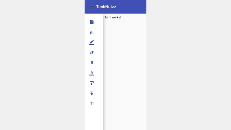
ng g c form
These commands generate specific components tailored for distinct functionalities within the application. The TopNavComponent is designed to construct the top navigation menu, providing a user-friendly interface for navigation. Meanwhile, the SideNavComponent and SideNavClosedComponent components are dedicated to crafting the open and closed states of the side navigation, respectively. Lastly, the FormComponent serves as a testing ground for validating the application’s behavior.
By structuring the application with these components, you establish a foundation for building a responsive material side nav in Angular. The modular approach ensures a clear organization of functionalities, simplifying the development process and enhancing the maintainability of the application as it evolves.
Routes in Angular app
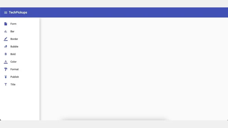 Sidenav menu in Angular
The next step involves creating Angular routes using a file named child-route.ts within the app directory to manage the configuration of menu items for the side navigation.
import { FormComponent } from './form/form.component';

export const childRoutes = [
  {
    path: 'form',
    component: FormComponent,
    data: { icon: 'insert_drive_file', text: 'Form' }
  },
  {
    path: 'chart',
    component: FormComponent,
    data: { icon: 'bar_chart', text: 'Bar' }
  },
  {
    path: 'chart',
    component: FormComponent,
    data: { icon: 'border_color', text: 'Border' }
  },
  {
    path: 'chart',
    component: FormComponent,
    data: { icon: 'bubble_chart', text: 'Bubble' }
  },
  {
    path: 'chart',
    component: FormComponent,
    data: { icon: 'format_bold', text: 'Bold' }
  },
  {
    path: 'chart',
    component: FormComponent,
    data: { icon: 'format_color_text', text: 'Color' }
  },
  {
    path: 'chart',
    component: FormComponent,
    data: { icon: 'format_paint', text: 'Format' }
  },
  {
    path: 'chart',
    component: FormComponent,
    data: { icon: 'publish', text: 'Publish' }
  },
  {
    path: 'chart',
    component: FormComponent,
    data: { icon: 'title', text: 'Title' }
  },
];
If you examine the content closely, you’ll notice an object named data within the childRoutes array.
This object contains fields for icons and text, which determine how the side menu items will appear. Additional items can be added to this object as needed, extending the versatility of the side navigation. The complete child-route.ts file outlines various paths, each associated with a component (in this case, the FormComponent) and specific icon-text pairs.
For instance, the ‘Form’ path is linked with an ‘insert_drive_file’ icon and the text ‘Form’, while other paths have their own unique icon-text combinations. This file serves as a centralized hub for defining the menu structure, facilitating easy customization and expansion of the side navigation menu in the Angular application.
App Component in Angular App
Now, let’s examine the AppComponent. In this component, we use the Angular Flex layout module to ensure the responsiveness of our sidebar. To maintain consistency, we set the width of the opened side nav to 250px and the closed side nav to 90px using the variables closedWidth and openedWidth within the AppComponent. Additionally, the MatDrawerMode directive proves instrumental in governing the side nav’s appearance, adapting it dynamically based on the screen size.
To achieve this adaptability, we make use of the MediaObserver from the FlexLayout module. This injectable Observer service detects changes in media queries, allowing us to adjust the attributes of the navigation bar using nav bar attributes in response to variations in viewport size. By incorporating these techniques, we ensure that our sidebar remains responsive, providing an optimal user experience across different devices and screen dimensions. The combination of the Flex layout module and MediaObserver enables us to effortlessly manage the appearance and behavior of the side nav, enhancing the overall usability of the Angular application.
Side and Over in Angular Material sidenav
In the Angular Material side nav, the terms “side” and “over” refer to how the navigation interacts with other components based on the device’s screen size. When viewed on mobile devices, the side nav appears “over” the other components, as depicted in the left-hand side image. In contrast, on desktop devices, it positions itself to the “side” of the screen, as shown in the right-hand side image. The distinction between the side and over configurations becomes evident when observing the behavior of the Angular material side nav across different devices.
To implement this behavior, the app.component.ts file holds the necessary logic. This TypeScript file defines the AppComponent class, which manages various aspects of the side nav. Through the use of Angular Material and Flex layout modules, the code adapts the side nav’s appearance and behavior based on the screen size. The subscription to the MediaObserver service enables real-time detection of changes in the media query, allowing the application to dynamically switch between the “side” and “over” modes.
Additionally, the code incorporates functionality for toggling the side nav, adjusting menu visibility, and handling toolbar behavior. By balancing these elements, the Angular Material side nav transitions between “side” and “over” modes, ensuring an optimal user experience on both mobile and desktop platforms. This approach simplifies the management of responsive design and enhances the usability of the Angular application across a variety of devices.
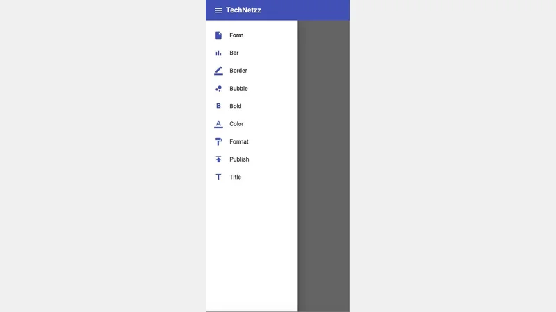 Over in Angular material side nav
 Side in Angular material side nav
Completed app.component.ts
import { Component, OnInit, OnDestroy, AfterViewInit, ViewChild } from '@angular/core';
import { MatSidenav, MatSidenavContainer } from '@angular/material/sidenav';
import { MediaObserver, MediaChange } from '@angular/flex-layout';
import { Observable, map } from 'rxjs';

@Component({
  selector: 'app-root',
  templateUrl: './app.component.html',
  styleUrls: ['./app.component.scss']
})
export class AppComponent implements OnInit, OnDestroy, AfterViewInit {
  title = 'Material-Side-Navbar-In-Angular';

  @ViewChild(MatSidenavContainer) sidenavContainer!: MatSidenavContainer;
  @ViewChild('snav') sideNav!: MatSidenav;
  sideNavDefaultOpened = true;
  showFullMenu = true;
  isExpanded = true;
  closedWidth = 90;
  openedWidth = 250;
  isMobile!: boolean;
  sideNavMode: 'side' | 'over' = 'side';
  hasBackdrop: boolean = false;
  toolBarHeight = 64;
  private readonly mediaWatcher: Observable<boolean>;;
  isDarkTheme: boolean = false;
  constructor(media: MediaObserver) {
    this.mediaWatcher = media.asObservable()
      .pipe(
        map((changes: MediaChange[]) =>
          changes.some(
            (change: MediaChange) => {
              // if in mobile view
              if (change.mqAlias === 'sm' || change.mqAlias === 'xs') {
                // if side nav is already opened in mobile view
                if (this.sideNavDefaultOpened) {
                  // close side nav in mobile view
                  this.sideNavDefaultOpened = false;
                  this.isExpanded = false;
                }
                this.isMobile = true;
                this.showFullMenu = true;
                this.sideNavMode = 'over';
                this.hasBackdrop = true;
              } else { // if not in mobile view
                this.isMobile = false;
                // open side nav
                this.sideNavDefaultOpened = true;
                this.sideNavMode = 'side';
                this.hasBackdrop = false;
              }

              // change tool bar height in mobile view
              if (change.mqAlias === 'xs') {
                this.toolBarHeight = 56;
              } else {
                this.toolBarHeight = 64;
              }
            }
          )
        )
      );
  }
  ngAfterViewInit(): void {
    this.sidenavContainer.scrollable.elementScrolled().subscribe((a: any) => {

    });
  }
  ngOnInit() { }

  ngOnDestroy(): void {
    // this.mediaWatcher.unsubscribe();
  }

  onToolbarMenuToggle() {
    if (this.isMobile) {
        this.sideNav.toggle();
    } else {
      if (!this.isExpanded) {
          this.showFullMenu = true;
      } else {
        this.showFullMenu = false;
      }
    }
    this.isExpanded = !this.isExpanded;
  }
}
Angular Material Top Bar in app
In this Angular application, the TopNavComponent plays a key role in managing user interactions with the top bar. A notable feature is the sideNavToggled event emitter within this component. When users click on the menu icon in the top bar, this event emitter is triggered. The emitted event serves as a signal that is harnessed in the app.component.ts file to effectively control the behavior of the side nav.
The TypeScript code snippet exemplifies the implementation within the TopNavComponent. This component, responsible for rendering and handling the top bar, incorporates an Output decorator to create the sideNavToggled event emitter. The associated toggleSidebar function is pivotal in emitting the event when invoked. By establishing this communication channel, the TopNavComponent ensures that interactions in the top bar can influence the behavior of the side nav in the broader context of the application.
Moreover, the TopNavComponent is equipped with additional functionality, exemplified by the onLoggedout method. This method, triggered when users log out, not only removes the ‘isLoggedin’ status from local storage but also navigates them back to the application’s home route, enhancing the overall user experience and security of the Angular application.
This is the completed top-nav.component.ts
import { Component, OnInit, Output, EventEmitter } from '@angular/core';
import { Router } from '@angular/router';

@Component({
  selector: 'app-top-nav',
  templateUrl: './top-nav.component.html',
  styleUrls: ['./top-nav.component.scss']
})
export class TopNavComponent implements OnInit {
  @Output() sideNavToggled = new EventEmitter<void>();
  constructor(private readonly router: Router) {}

  ngOnInit() {}

  toggleSidebar(): void {
    this.sideNavToggled.emit();
  }

  onLoggedout() {
    localStorage.removeItem('isLoggedin');
    this.router.navigate(['/']);
  }
}
Angular SideNav Component in App
The SideNavComponent is designed to dynamically populate the side navigation menu using the route configurations from the child-route.ts file. This file contains details about each menu item, including both text and icons, contributing to a visually informative side nav menu. The HTML structure within the side-nav.component.html file succinctly encapsulates the rendering logic. Using Angular directives such as *ngFor, the component iterates through the route configurations, generating list items with corresponding icons and text. The MatListModule is utilized to structure and style the side nav menu for a cohesive and user-friendly display.
This is the complete side-nav.component.html
<mat-nav-list>
  <a *ngFor="let item of routes"  mat-list-item [routerLinkActive]="'active-link'" [routerLink]="['/', item.path]">
    <mat-icon color="primary" class="sidenav-icon">{{ item.data.icon }}</mat-icon>
    <span>{{ item.data.text }}</span>
  </a>
</mat-nav-list>
Additionally, the Angular application includes another component named SideNavClosedComponent, dedicated to the configurations of the closed side nav. Unlike its opened counterpart, this component exclusively displays menu icons. The HTML structure of side-nav-closed.component.html follows a similar approach as the opened side nav, leveraging MatListModule for creating a concise and icon-centric menu. By encapsulating menu configurations within separate components, the application achieves modularity and ease of maintenance, simplifying future updates and enhancements.
This is the complete side-nav-closed.component.html
<mat-nav-list>
  <a *ngFor="let item of routes" mat-list-item [routerLinkActive]="'active-link'" [routerLink]="['/', item.path]">
    <mat-icon color="primary" class="sidenav-icon">{{ item.data.icon }}</mat-icon>
  </a>
</mat-nav-list>
Both the SideNavComponent and SideNavClosedComponent contribute to a cohesive and functional side navigation system. Through the careful utilization of Angular modules and directives, these components enable the creation of responsive and visually appealing side nav menus, enhancing the overall navigation experience for users in the Angular application.
- Complete code can be found in github.
Conclusion
In summary, side navigation menus serve as an effective means to organize and present structured menus in web applications. The Angular Material package offers a convenient solution with its pre-built Angular Material side nav component. By simply importing and configuring this component, developers can integrate it into their projects, creating visually appealing and functional web dashboards. This pre-built functionality minimizes the need for extensive coding, enabling a straightforward implementation process. The Angular Material side nav proves to be a valuable tool for enhancing the user interface and navigation experience.
Comments
There are no comments yet.