Angular Material UI: Create a Stunning Admin Dashboard
In this guide, We'll walk you through the process of building an Angular material admin dashboard. Modern admin websites find dashboards to be crucial components, and there are several reasons for their importance.
The admin dashboard we aim to create holds significant value for managing various aspects of a website efficiently. It leverages Angular material for simplifying the process of developing user interfaces. The end result will be a functional and visually appealing dashboard that you can utilize for your own projects.
The tutorial will guide you through the process, making it accessible whether you’re integrating the dashboard into an existing Angular material app or starting a new one from scratch. Our focus is on providing a practical, hands-on experience, avoiding complex jargon and keeping the steps straightforward.
-
The dashboard we’re creating can integrate into an existing Angular material app or serve as the foundation for a new one.
-
This tutorial is the 2 part of the Angular material series. In the Part 1, we crafted a responsive Angular side nav bar using Angular material components. Building upon that, this tutorial will extend our progress.
-
Rather than starting from scratch, you have the option to kick off your project using the Angular startup template. Simply clone the startup template from this git repository.
-
If you prefer starting a new Angular app, you can follow the steps outlined in the Develop Angular applications using Typescript tutorial.
Angular Material Admin Dashboard Overview
At the end of this tutorial, our goal is to build an Angular material admin dashboard that mirrors the one showcased in this video on Youtube. Throughout the tutorial, we’ll go step by step to achieve this, ensuring a clear and straightforward approach.
Create Angular Material Dashboard Components
After cloning the repository, open the project in your favorite IDE (e.g., VS code) and execute the command npm install in the terminal. This command will download and install all the NPM dependencies necessary for the project.
With the dependencies installed, the next step is to create the essential components for the Angular material dashboard. To achieve this, navigate to the project root and run the following commands in the terminal
- You can access the terminal in VS code by pressing command+j on Mac or clicking on Terminal in the menu and then selecting New Terminal.
ng g c stat --module app.module.ts
ng g c dashboard --module app.module.ts
Executing these commands will automatically add the stat component and dashboard component to the project. Additionally, the app.module.ts file will be updated to include these two components. The dashboard component is designed to utilize the stat component to display statistics, enhancing reusability.
- To ensure our Angular material dashboard is mobile responsive, we’ll use the FlexLayoutto. Therefore, we need to import the FlexLayoutModule in AppModule.
Once done above steps, the app.module.ts file will look like this.
import { NgModule } from '@angular/core';
import { BrowserModule } from '@angular/platform-browser';

import { AppRoutingModule } from './app-routing.module';
import { AppComponent } from './app.component';
import { BrowserAnimationsModule } from '@angular/platform-browser/animations';
import { SideNavClosedComponent } from './side-nav-left/side-nav-closed/side-nav-closed.component';
import { SideNavComponent } from './side-nav-left/side-nav/side-nav.component';
import { TopNavComponent } from './top-nav/top-nav.component';
import { FormComponent } from './form/form.component';
import { ReactiveFormsModule, FormsModule } from '@angular/forms';
import { MaterialModule } from './material.module';
import { DashboardComponent } from './dashboard/dashboard.component';
import { StatComponent } from './stat/stat.component';
import { FlexLayoutModule } from '@angular/flex-layout';

@NgModule({
  declarations: [
    AppComponent,
    SideNavClosedComponent,
    SideNavComponent,
    TopNavComponent,
    FormComponent,
    DashboardComponent,
    StatComponent
  ],
  imports: [
    BrowserModule,
    AppRoutingModule,
    BrowserAnimationsModule,
    ReactiveFormsModule,
    MaterialModule,
    FlexLayoutModule
  ],
  providers: [],
  bootstrap: [AppComponent]
})
export class AppModule { }
Update material.module.ts
In the cloned template project, you’ll find a file named material.module.ts in the root folder. This file plays a crucial role as it houses all the Angular material modules essential for our project. This approach is adopted to enhance the project’s maintainability, making it easier to manage and update.
For our admin dashboard, we’ll be incorporating Angular material cards. To enable the use of MatCardModule, we need to import it into the material.module.ts file. After this addition, the material.module.ts file will be updated to include the necessary modules for Angular material cards, setting the stage for their seamless integration into our project.
- By keeping our material-related modules organized in a dedicated file, we streamline the process of managing dependencies, making it more straightforward to track and modify the elements crucial to our Angular material dashboard. This organizational strategy contributes to the overall efficiency and clarity of our project structure.
Once done that material.module.ts will look like this.
import { NgModule } from '@angular/core';
import { MatButtonModule } from '@angular/material/button';
import { MatToolbarModule } from '@angular/material/toolbar';
import { MatIconModule } from '@angular/material/icon';
import { MatSidenavModule } from '@angular/material/sidenav';
import { MatListModule } from '@angular/material/list';
import { MatSlideToggleModule } from '@angular/material/slide-toggle';
import { MatCardModule } from '@angular/material/card';

@NgModule({
    imports: [
        MatButtonModule,
        MatToolbarModule,
        MatIconModule,
        MatSidenavModule,
        MatListModule,
        MatSlideToggleModule,
        MatCardModule
    ],
    exports: [
        MatButtonModule,
        MatToolbarModule,
        MatIconModule,
        MatSidenavModule,
        MatListModule,
        MatSlideToggleModule,
        MatCardModule
    ]
})

export class  MaterialModule {}
Update Angular Reusable stat Component
Moving forward, our focus is on enhancing the reusable stat component by incorporating logic, HTML markup, and styles. The stat component has three inputs.
- For those seeking additional customization, feel free to introduce more input variables. The goal is to make the stat component highly adaptable to various requirements, ensuring its usefulness across different contexts.
Icon: A string-type input variable enabling the specification of the Angular material icon to be showcased within the stat component.
Count: A number-type input variable that captures the count of each item, providing a dynamic element to the component.
Label: A string-type input variable used to designate the label associated with the displayed statistics.
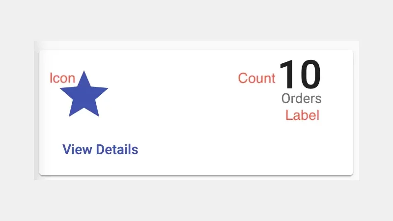 Reusable stat component
Here is the completed stat component.
import { Component, OnInit, Input } from '@angular/core';

@Component({
  selector: 'app-stat',
  templateUrl: './stat.component.html',
  styleUrls: ['./stat.component.scss']
})
export class StatComponent implements OnInit {

  @Input() icon!: string;
  @Input() count!: number;
  @Input() label!: string;
  constructor() { }

  ngOnInit(): void {
  }

}
<mat-card>
  <mat-card-header>
    <div mat-card-avatar>
      <mat-icon class="icon-lg" color="primary">{{icon}}</mat-icon>
    </div>
    <mat-card-title>{{count}}</mat-card-title>
    <mat-card-subtitle>{{label}}</mat-card-subtitle>
  </mat-card-header>
  <mat-card-actions>
    <button mat-button color="primary" class="float-right">View Details</button>
  </mat-card-actions>
</mat-card>
:host ::ng-deep .mat-card-header-text {
  width: 100%;
  text-align: right;
}

.icon-lg {
  font-size: 45px;
  width: 50px;
  height: 50px;
}

.mat-card {
  .mat-icon{
    width: 90px;
    height: 90px;
  }
  .mat-card-header {
    width: 100%;
  }

  .mat-card-title {
    font-size: 40px !important;
  }

  .mat-card-subtitle {
    white-space: nowrap;
  }
}
Update the Angular Material Dashboard Component
Let’s proceed by enhancing the Angular material dashboard component. In this update, we introduce an interface named Card, encompassing properties such as imgSrc, name, and description. These properties play a crucial role in populating each Angular material card within the dashboard. If desired, users can introduce additional properties for further customization, tailoring the cards to their specific needs.
The cards array serves as a repository of information, dictating how each card should be presented and what data it should showcase. The complete dashboard.component.ts file encapsulates these essential elements, providing a comprehensive and organized structure for managing the dashboard’s content.
- By adopting this approach, we establish a dynamic and easily customizable Angular material dashboard component. Users have the flexibility to modify and extend the properties of the Card interface and the cards array, enabling them to create a personalized and versatile dashboard that aligns with their unique requirements.
This is the complete dashboard.component.ts file.
import { Component, OnInit } from '@angular/core';

interface Card {
  imgSrc: string;
  name: string;
  description: string;
}

@Component({
  selector: 'app-dashboard',
  templateUrl: './dashboard.component.html',
  styleUrls: ['./dashboard.component.scss']
})
export class DashboardComponent implements OnInit {

  cards: Array<Card> = [];
  orders_count = 10;
  reviews_count = 150;
  clicks_count = 430;
  shares_count = 43;

  constructor() { }

  ngOnInit() {
    this.cards = [
      {
        imgSrc: 'https://pixabay.com/get/gff9a506e8b90bcb8552d7ae83410f1ac1cccf4f7bb09585d8eb4a264de12b10ce9bee4a68681fa9c7d33bc8be8a62baa635ea281a7b2b12592fd77e817f765e9425c9ff897e76d7efd0cca0f9cb1dbf6_1920.jpg',
        name: 'Understanding',
        description: `In-depth knowledge and experience make it possible to solve problems. Thanks TheDigitalArtist for the image(pixabay.com thedigitalartist-202249)`
      },
      {
        imgSrc: 'https://pixabay.com/get/gd1606a498a12e850d5dd3e5f70d79eafee461b711d719fb25755c9c4dfcf1c7116c303ad01737ea724a8878266d552a946bfd8da869b30c2766687b17cadc2dfdcea5babd5c3d9e586716846a97ff9bc_1920.jpg',
        name: 'Planing',
        description: `Plan before doing anything. That will help to make a quality product. Thanks lukasbieri for the image(pixabay.com lukasbieri-4664461)`
      },
      {
        imgSrc: 'https://pixabay.com/get/ge5a1df40a7aae0fea706f1b3c78ae970804b399a8da933b9996daf2bbaed5482e4bbe96deb632ba7214e1e6ad806bcee350001c4c65b3207df57b722bf4e8d22927b686f034e33d883a0590ba2201e8f_1920.jpg',
        name: 'Implementing',
        description: `Implement quickly what we have planed. Do revisions until you satisfy. Thanks geralt for the image(pixabay.com geralt-9301)`
      }
    ];
  }

}
As you can see in the below code, the state component will be used to populate stats. Here is the complete dashboard.component.html file.
<div fxLayout="row wrap" fxLayout.xs="column" fxLayoutAlign="space-between stretch">
  <div class="mb10" fxFlex="24" fxFlex.lt-lg="49">
    <app-stat [icon]="'star_order'" [count]="orders_count" [label]="'Orders'"></app-stat>
  </div>
  <div class="mb10" fxFlex="24" fxFlex.lt-lg="49">
    <app-stat [icon]="'rate_review'" [count]="reviews_count" [label]="'Reviews'"></app-stat>
  </div>
  <div class="mb10" fxFlex="24" fxFlex.lt-lg="49">
    <app-stat [icon]="'mouse'" [count]="clicks_count" [label]="'Clicks'"></app-stat>
  </div>
  <div class="mb10" fxFlex="24" fxFlex.lt-lg="49">
    <app-stat [icon]="'share'" [count]="shares_count" [label]="'Shares'"></app-stat>
  </div>
</div>

<div fxLayout="row wrap" fxLayout.xs="column" fxLayoutGap="10px">
  <div class="mb10" fxFlex="32"  fxFlex.lt-lg="49" *ngFor="let item of cards">
    <mat-card>
      <img mat-card-image [src]="item.imgSrc">
      <mat-card-header style="justify-content: center">
        <mat-card-title>
          <h3 class="m-0">{{item.name}}</h3>
        </mat-card-title>
      </mat-card-header>
      <mat-card-content>
        {{item.description}}
      </mat-card-content>
      <mat-card-actions>
        <button color="primary" mat-button>
          <mat-icon class="location-icon">expand_more</mat-icon>
        </button>
        <button color="primary" mat-button>
          <mat-icon class="location-icon">share</mat-icon>
        </button>
        <button color="primary" mat-button>
          <mat-icon class="location-icon">thumb_up</mat-icon>
        </button>
      </mat-card-actions>
    </mat-card>
  </div>
</div>
.mb10{
  margin-top: 10px;
}

.mt20 {
  margin-top: 20px;
}
Add route for the Angular Material dashboard component
The next step involves implementing routing to ensure the navigation. Open the child-routes.ts file and introduce a routing entry for the dashboard component. This entry defines how the application should navigate to the dashboard when prompted.
Within the data object of the routing entry, users have the flexibility to override both the icon and text displayed in the side nav bar. This customization allows for a personalized touch, aligning the dashboard presentation with the specific preferences of the user.
Here is the complete child-routes.ts file after adding the routing entry.
import { FormComponent } from './form/form.component';
import { DashboardComponent } from './dashboard/dashboard.component';

export const childRoutes = [
  {
    path: 'dashboard',
    component: DashboardComponent,
    data: { icon: 'dashboard', text: 'Dashboard' }
  },
  {
    path: 'form',
    component: FormComponent,
    data: { icon: 'bar_chart', text: 'Form' }
  },
  {
    path: 'chart',
    component: FormComponent,
    data: { icon: 'border_color', text: 'Border' }
  },
  {
    path: 'chart',
    component: FormComponent,
    data: { icon: 'bubble_chart', text: 'Bubble' }
  },
  {
    path: 'chart',
    component: FormComponent,
    data: { icon: 'format_bold', text: 'Bold' }
  },
  {
    path: 'chart',
    component: FormComponent,
    data: { icon: 'format_color_text', text: 'Color' }
  },
  {
    path: 'chart',
    component: FormComponent,
    data: { icon: 'format_paint', text: 'Format' }
  },
  {
    path: 'chart',
    component: FormComponent,
    data: { icon: 'publish', text: 'Publish' }
  },
  {
    path: 'chart',
    component: FormComponent,
    data: { icon: 'title', text: 'Title' }
  },
];
While incorporating a routing entry in the child-routes.ts file is a crucial step, it alone isn’t sufficient to ensure proper functionality. To make the route work, essential adjustments need to be made in the app-routing.module.ts file. This involves importing routes from the child-routes.ts file to establish a connection between different sections of the application.
Additionally, we introduce an entry in the app-routing.module.ts file to redirect any non-existing paths to the dashboard module. This redirection ensures that when the application is initially launched, the dashboard component is displayed by default. This user-friendly feature simplifies the navigation experience for users accessing the application for the first time.
This is the complete app-routing.module.ts file.
import { NgModule } from '@angular/core';
import { RouterModule, Routes } from '@angular/router';
import { childRoutes } from './child-routes'

const routes: Routes = [
  ...childRoutes,
  {
    path: '**',
    redirectTo: 'dashboard'
  }
];

@NgModule({
  imports: [RouterModule.forRoot(routes)],
  exports: [RouterModule]
})
export class AppRoutingModule { }
Your Angular material admin dashboard is now fully assembled and ready for use. To witness the results of your efforts, open your web browser and navigate to http://localhost:4200. If you have diligently followed each step outlined in the tutorial, you should be greeted with a functional dashboard displayed on your browser.
Feel free to explore the features of your newly created Angular material admin dashboard and make any additional customizations or enhancements according to your specific needs. Your accomplishment is a testament to your proficiency in web development with Angular material.
Conclusion
Dashboards serve as invaluable tools for condensing and scrutinizing business statistics. Their significance lies in their ability to provide a comprehensive overview and analysis of key metrics, making them an essential component of contemporary admin websites. Angular material emerges as a practical solution for swiftly crafting these dashboards, offering a library equipped with pre-built UI components.
With the Angular Material library, developers gain access to a repertoire of pre-designed UI components, streamlining the development process and accelerating the creation of effective dashboards. This efficiency is particularly advantageous for web developers seeking to enhance the user experience by presenting data in a clear and organized format.
Comments
There are no comments yet.