Angular Material Table: Create a Responsive Table
Developing responsive tables is crucial for effective data presentation in Angular applications. Throughout this tutorial, we will explore the practical aspects of implementing and customizing Angular material tables. The goal is to provide you with a hands-on experience, enabling you to integrate responsive tables into your Angular projects.
- Angular Material Table Example Overview?
- Install dependencies for the Angular Material Table
- Update material.module.ts with Angular Material Modules
- Create Components and Services for Angular Material Table
- Update the app.module.ts Angular Modules
- Create the Angular Form Validator
- Setup Angular Route for Material Table Component
- Update Angular Alert Service for Material Table
- Update Angular Material Table Service
- Update Angular Material alert-box Component
- Update Angular Material dialog-box Component
- Update Angular Material Table Component
- File Structure of Angular Material Table Example
- Conclusion
This is the part 3 of the Angular material series. We’ll continue building the responsive Angular material table from where we left off in the last tutorial(part 2).
To simplify your starting point, I’ve already put together a basic template using Angular material. You can grab the template by cloning the git repository and begin your work from there. However, it’s strongly recommended to go through the previous tutorials and update the starter template with the dashboard(part 2) as it will provide a solid foundation for your responsive Angular material project.
-
Part 1: How to create a responsive Angular material side nav(Already included in the starter template).
Angular Material Table Example Overview?
In this project, we’ll be crafting a responsive Angular material table, integrating it with real-time COVID-19 data sourced from publicly accessible databases. The material table we’re building will come equipped with features like pagination, filters, the ability to show/hide columns, select multiple rows, delete multiple rows, and even an option to export data to Excel. You can get a preview of these functionalities in the demonstration video on youtube.
This tutorial aims to guide you through the process of enhancing your Angular skills by practically implementing essential features in a material table. By the end, you’ll have a functional and responsive table that you can integrate into your Angular applications. The accompanying video showcases all the features you’ll achieve through this tutorial, offering a glimpse into the capabilities of the final product. Let’s get started and bring these features to life in your Angular material table project.
Install dependencies for the Angular Material Table
To set up the material table, we need to add a specific library called mat-table-exporter to our project. This library is not included in the default dependencies listed in the package.json file, so we have to install it separately. You can do this by running the following command in the terminal.
npm i mat-table-exporter@14.0.0
If you encounter any issues related to peer dependencies during the installation, you can try using the --force flag with the command. This flag allows the installation to proceed, ignoring peer dependency errors**. However, keep in mind that using --force may introduce complications into your Angular project. It’s essential to verify that it doesn’t disrupt your existing functionalities.
Ensuring the proper installation of the mat-table-exporter library is crucial for enabling additional features, such as the export to Excel option, in your Angular material table. By following these steps, you’ll be on your way to enhancing the capabilities of your material table with the desired functionalities.
Update material.module.ts with Angular Material Modules
After installing the mat-table-exporter library, the next step is to update the material.module.ts file with the necessary Angular material modules. This file acts as a centralized location for all material-related imports, maintaining simplicity in the project structure.
Once all the required modules are imported, the material.module.ts file will be structured as follows:
import { NgModule } from '@angular/core';
import { MatButtonModule } from '@angular/material/button';
import { MatToolbarModule } from '@angular/material/toolbar';
import { MatIconModule } from '@angular/material/icon';
import { MatSidenavModule } from '@angular/material/sidenav';
import { MatListModule } from '@angular/material/list';
import { MatSlideToggleModule } from '@angular/material/slide-toggle';
import { MatCardModule } from '@angular/material/card';
import { MatPaginatorModule } from '@angular/material/paginator';
import { MatSortModule } from '@angular/material/sort';
import { MatInputModule } from '@angular/material/input';
import { MatTableModule } from '@angular/material/table';
import { MatFormFieldModule } from '@angular/material/form-field';
import { MatCheckboxModule } from '@angular/material/checkbox';
import { MatProgressSpinnerModule } from '@angular/material/progress-spinner';
import { MatSelectModule } from '@angular/material/select';
import { MatMenuModule } from '@angular/material/menu';
import { MatTableExporterModule } from 'mat-table-exporter';
import { MatDialogModule } from '@angular/material/dialog';

@NgModule({
    imports: [
        MatButtonModule,
        MatToolbarModule,
        MatIconModule,
        MatSidenavModule,
        MatListModule,
        MatSlideToggleModule,
        MatCardModule,
        MatPaginatorModule,
        MatSortModule,
        MatInputModule,
        MatTableModule,
        MatFormFieldModule,
        MatCheckboxModule,
        MatProgressSpinnerModule,
        MatSelectModule,
        MatMenuModule,
        MatTableExporterModule,
        MatDialogModule
    ],
    exports: [
        MatButtonModule,
        MatToolbarModule,
        MatIconModule,
        MatSidenavModule,
        MatListModule,
        MatSlideToggleModule,
        MatCardModule,
        MatPaginatorModule,
        MatSortModule,
        MatInputModule,
        MatTableModule,
        MatFormFieldModule,
        MatCheckboxModule,
        MatProgressSpinnerModule,
        MatSelectModule,
        MatMenuModule,
        MatTableExporterModule,
        MatDialogModule
    ]
})

export class  MaterialModule {}
This update ensures that your Angular material table project is equipped with the necessary modules, allowing seamless integration of the mat-table-exporter library and enabling the desired features for your responsive material table.
Create Components and Services for Angular Material Table
The next step is to create the necessary components and services. Each component serves a specific purpose in enhancing the functionality of the material table. The table component is designed for constructing the material table itself. The dialog-box component comes into play for managing row addition and editing through a modal interface. The alert-box component is responsible for creating a confirmation modal dialog to get user confirmation for critical actions, such as deleting rows. The images below provide a glimpse of how each component will appear by the end of this tutorial.
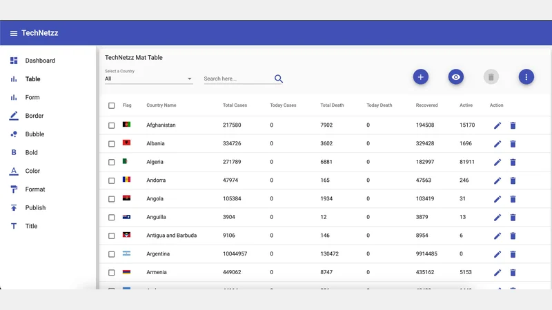 Angular material Table component
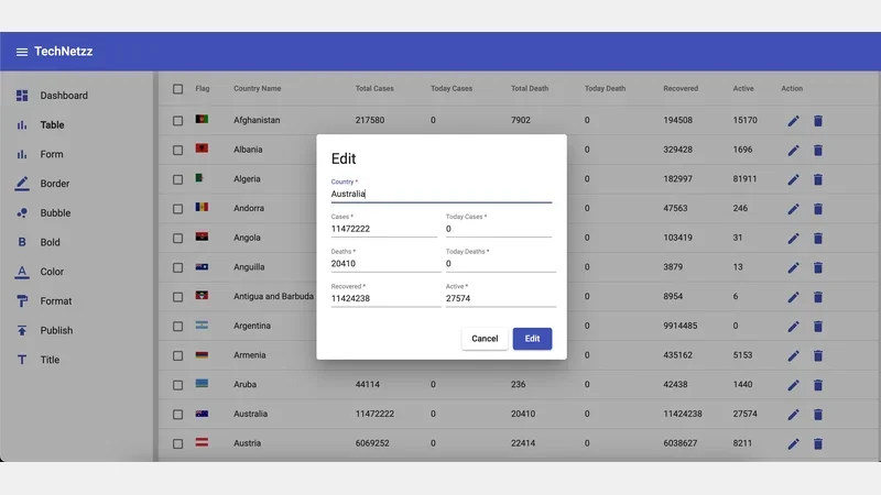 Angular material Add/Edit dialog-box component
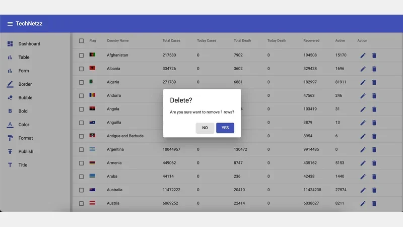 Angular material Confirmation alert component
To create these components, open the terminal in the project’s root folder and execute the following commands. These ng commands will generate the necessary components and automatically update the app.module.ts file with the required imports.
ng g c table --module app.module.ts
ng g c dialog-box --module app.module.ts
ng g c alert-box --module app.module.ts
Now that the components are generated, the next step is to create the required services. For this Angular tutorial, two services will be used. The table service will handle API requests to fetch COVID-19 data, while the alert service will be responsible for triggering alert dialogs based on user events. Run the following ng commands to generate these services in a directory called util.
ng g s utils/table
ng g s utils/alert
These services and components collectively form the backbone of the Angular material table, providing the necessary structure for fetching and displaying COVID-19 data while ensuring a user-friendly interface with alert and confirmation functionalities.
Update the app.module.ts Angular Modules
In the process of generating components, specific imports were automatically added to the app.module.ts file. Now, it’s time to update this file further by importing additional application-level modules. These modules play a crucial role in the overall functionality and structure of the Angular application. Once these imports are incorporated, the app.module.ts file will be configured as follows.
import { NgModule } from '@angular/core';
import { BrowserModule } from '@angular/platform-browser';

import { AppRoutingModule } from './app-routing.module';
import { AppComponent } from './app.component';
import { BrowserAnimationsModule } from '@angular/platform-browser/animations';
import { SideNavClosedComponent } from './side-nav-left/side-nav-closed/side-nav-closed.component';
import { SideNavComponent } from './side-nav-left/side-nav/side-nav.component';
import { TopNavComponent } from './top-nav/top-nav.component';
import { FormComponent } from './form/form.component';
import { ReactiveFormsModule, FormsModule } from '@angular/forms';
import { MaterialModule } from './material.module';
import { DashboardComponent } from './dashboard/dashboard.component';
import { StatComponent } from './stat/stat.component';
import { FlexLayoutModule } from '@angular/flex-layout';
import { TableComponent } from './table/table.component';
import { DialogBoxComponent } from './dialog-box/dialog-box.component';
import { HttpClientModule } from '@angular/common/http';
import { AlertBoxComponent } from './alert-box/alert-box.component';

@NgModule({
  declarations: [
    AppComponent,
    SideNavClosedComponent,
    SideNavComponent,
    TopNavComponent,
    FormComponent,
    DashboardComponent,
    StatComponent,
    TableComponent,
    DialogBoxComponent,
    AlertBoxComponent,
  ],
  imports: [
    BrowserModule,
    AppRoutingModule,
    BrowserAnimationsModule,
    ReactiveFormsModule,
    MaterialModule,
    FlexLayoutModule,
    FormsModule,
    HttpClientModule
  ],
  providers: [],
  bootstrap: [AppComponent]
})
export class AppModule { }
By updating the app.module.ts file with these imports, you ensure that the Angular application is equipped with the necessary modules and components. This configuration lays the foundation for a well-organized and functional application that can effectively manage and display COVID-19 data through the Angular material table.
Create the Angular Form Validator
To facilitate the addition and editing of rows in the table, we’ll create a form with proper validation rules and error messages. The goal is to enhance the maintainability and scalability of our Angular application by storing these rules and messages in a dedicated file named form-validator.ts within the utils directory. This approach ensures a centralized location for managing form-related functionalities. After completing this task, the form-validator.ts file will take the following structure.
// Collection of reusable RegExps
export const regExps: { [key: string]: RegExp } = {
    str: /^[a-zA-Z]/, // Validates only strings
    num: /^\d+$/, // Validates only numbers
};

// Collection of reusable error messages
export const errorMessages: { [key: string]: string } = {
    country: 'Required and only strings',
    cases: 'Required and only numbers',
    todayCases: 'Required and only numbers',
    deaths: 'Required and only numbers',
    todayDeaths: 'Required and only numbers',
    recovered: 'Required and only numbers',
    active: 'Required and only numbers',
};
In this file, we define a set of regular expressions (RegExps) to validate string and number inputs. The ‘str’ regular expression ensures that only strings are accepted, while the ‘num’ regular expression validates only numerical inputs. Additionally, a collection of error messages is provided, specifying the required input type for each form field. This structured approach to form validation contributes to the clarity and simplicity of managing input validation rules across the Angular application.
Setup Angular Route for Material Table Component
As mentioned in the previous tutorial, we manage all route configurations in a dedicated file called child-routes.ts. Now, it’s time to set up the routes specifically for the table component. The entries in the childRoutes array determine the entries that will populate the side navigation bar. The completed child-routes.ts file is structured as follows.
import { FormComponent } from './form/form.component';
import { DashboardComponent } from './dashboard/dashboard.component';
import { TableComponent } from './table/table.component';

export const childRoutes = [
  {
    path: 'dashboard',
    component: DashboardComponent,
    data: { icon: 'dashboard', text: 'Dashboard' }
  },
  {
    path: 'table',
    component: TableComponent,
    data: { icon: 'table', text: 'Table' }
  },
  {
    path: 'form',
    component: FormComponent,
    data: { icon: 'bar_chart', text: 'Form' }
  },
  {
    path: 'chart',
    component: FormComponent,
    data: { icon: 'border_color', text: 'Border' }
  },
  {
    path: 'chart',
    component: FormComponent,
    data: { icon: 'bubble_chart', text: 'Bubble' }
  },
  {
    path: 'chart',
    component: FormComponent,
    data: { icon: 'format_bold', text: 'Bold' }
  },
  {
    path: 'chart',
    component: FormComponent,
    data: { icon: 'format_color_text', text: 'Color' }
  },
  {
    path: 'chart',
    component: FormComponent,
    data: { icon: 'format_paint', text: 'Format' }
  },
  {
    path: 'chart',
    component: FormComponent,
    data: { icon: 'publish', text: 'Publish' }
  },
  {
    path: 'chart',
    component: FormComponent,
    data: { icon: 'title', text: 'Title' }
  },
];
In this configuration, the ‘table’ route is linked to the TableComponent, which will be responsible for rendering the Angular material table. This organized structure allows for easy navigation and clear representation of components within the Angular application, enhancing the user experience and overall application management.
Update Angular Alert Service for Material Table
The Alert service plays a crucial role in managing the opening and closing of the alert box within our Angular application. Two functions are implemented in this service to handle these functionalities.
The open function is designed to accept parameters such as title, message, cancel text, and confirm text. These parameters are then passed into the AlertBoxComponent, where they are utilized to populate the content of the alert-box modal. The function initiates the opening of the alert box, creating a visual representation based on the provided parameters. An example of the alert box modal can be seen in the image below.
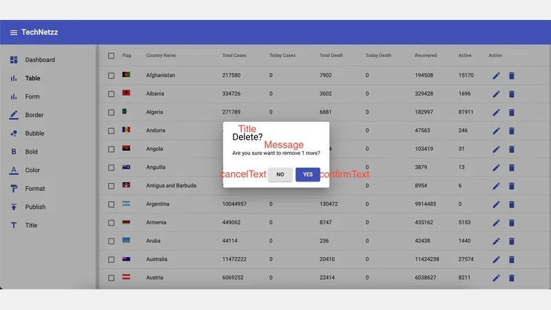 Angular material alert box
On the other hand, the confirmed() function serves the purpose of capturing the user’s response. It returns an Observable, allowing the TableComponent to receive a boolean response based on the user’s action, whether they confirmed or canceled the alert. The function utilizes the afterClosed() method of the MatDialogRef, ensuring that it only takes a single response and then completes.
The completed alert.service.ts file, as presented below, encapsulates these functionalities, providing a streamlined and efficient service for managing alerts within the Angular application.
import { Injectable } from '@angular/core';
import { Observable } from 'rxjs';
import { map, take } from 'rxjs/operators';
import { MatDialog, MatDialogRef, MAT_DIALOG_DATA } from '@angular/material/dialog';
import { AlertBoxComponent } from '../alert-box/alert-box.component'

@Injectable({
  providedIn: 'root'
})
export class AlertService {

  dialogRef!: MatDialogRef<AlertBoxComponent>;

  constructor(private dialog: MatDialog) { }

  public open(options: any) {
    this.dialogRef = this.dialog.open(AlertBoxComponent, {
      data: {
        title: options.title,
        message: options.message,
        cancelText: options.cancelText,
        confirmText: options.confirmText
      },
    });
  }

  public confirmed(): Observable<any> {
    return this.dialogRef.afterClosed().pipe(take(1), map(res => {
      return res;
    }
    ));
  }
}
Update Angular Material Table Service
In the table service, we’re utilizing a public REST API endpoint to retrieve COVID-19 data. The updated table service, table.service.ts, now includes two functions tailored to fetch this data. The first function, covid19Reports, is designed to fetch COVID-19 data for all countries. The second function, covid19ReportsByCountry, can be used to retrieve COVID-19 data specific to a particular country. This streamlined approach allows for flexibility in obtaining global or country-specific data as needed.
The service leverages the Angular HttpClient module to make HTTP requests to the provided API endpoints. The covid19Reports function, for instance, fetches data from the endpoint “https://disease.sh/v3/covid-19/countries,” providing a comprehensive overview of COVID-19 statistics worldwide.
Similarly, the covid19ReportsByCountry function allows users to fetch data for a specific country by appending the country’s name to the API endpoint. For instance, calling covid19ReportsByCountry("australia") would retrieve COVID-19 data for the Australia.
This approach ensures a straightforward and effective means of retrieving up-to-date COVID-19 data for display in the Angular material table. By utilizing the public API, the application can integrate the latest information, providing users with accurate and relevant statistics.
import { Injectable } from '@angular/core';
import { HttpClient } from '@angular/common/http';

@Injectable({
  providedIn: 'root'
})
export class TableService {

  constructor(private http: HttpClient) { }

  public covid19Reports() {
    return this.http.get("https://disease.sh/v3/covid-19/countries");
  }

  public covid19ReportsByCountry(country: string) {
    return this.http.get(`https://disease.sh/v3/covid-19/countries/${country}`);
  }
}
Update Angular Material alert-box Component
In the AlertBoxComponent, we retrieve the options passed by the alert service, which include the title, message, cancel text, and confirm text. The component’s functionality is centered around the user’s interaction with the alert box, determining whether they choose to cancel or confirm an action.
The component is structured in TypeScript, HTML, and CSS sections. In the TypeScript section, we utilize Angular’s MatDialogRef and MAT_DIALOG_DATA to access and handle the data provided by the alert service. The ngOnInit method is called upon component initialization. Two methods, cancel and confirm, are defined to handle the respective user actions. The cancel method closes the dialog with a boolean value of false, indicating the user’s decision not to proceed, while the confirm method closes the dialog with a boolean value of true, indicating confirmation.
In the HTML section, the alert box’s content is structured with a title, message, and action buttons for cancel and confirm. The data binding is used to dynamically populate the title and message based on the provided options. The action buttons trigger the corresponding methods when clicked, allowing for seamless user interaction.
The CSS section adds some styling to the header and dialog message, converting them to lowercase and capitalizing the first letter for a consistent and visually appealing display.
Overall, the AlertBoxComponent serves as a user-friendly modal for displaying alerts, allowing users to make informed decisions by confirming or canceling actions based on the provided information.
import { Component, OnInit, Inject } from '@angular/core';
import { MAT_DIALOG_DATA, MatDialogRef } from '@angular/material/dialog';

@Component({
  selector: 'app-alert-box',
  templateUrl: './alert-box.component.html',
  styleUrls: ['./alert-box.component.scss']
})
export class AlertBoxComponent implements OnInit {

  constructor(@Inject(MAT_DIALOG_DATA) public data: {
    cancelText: string,
    confirmText: string,
    message: string,
    title: string
  }, private mdDialogRef: MatDialogRef<AlertBoxComponent>) { }

  ngOnInit(): void {
  }

  public cancel() {
    this.mdDialogRef.close(false);
  }

  public confirm() {
    this.mdDialogRef.close(true);
  }
}
<div class="header">
  <h1 mat-dialog-title>{{ data.title  }}</h1>
</div>
<div mat-dialog-content>
  <p class="mat-body dialog-message">{{ data.message }}</p>
</div>
<div mat-dialog-actions style="float: right;">
  <button class="dialog-btn" mat-raised-button type="button" (click)="cancel()">{{ data.cancelText }}</button>
  <button class="dialog-btn" mat-raised-button color="primary" type="button"
    (click)="confirm()">{{ data.confirmText }}</button>
</div>
.header,
.dialog-message {
  text-transform: lowercase;
}
.header::first-letter,
.dialog-message::first-letter {
  text-transform: uppercase;
}
Update Angular Material dialog-box Component
In the DialogBoxComponent, we facilitate the creation of an Add/Edit modal dialog that utilizes Angular forms. This modal allows users to interact with the form to input or edit information related to COVID-19 data. The component employs FormGroup, FormBuilder, and Validators from Angular forms to structure and validate the Add/Edit form.
The form, named tableForm, consists of several form controls, each corresponding to a specific attribute of the COVID-19 data, such as country, cases, today’s cases, deaths, today’s deaths, recovered, and active cases. The form-validator file is utilized to enforce validation rules and display relevant error messages for user inputs.
The TypeScript section of the component includes the necessary logic for initializing and handling the form. The creatForm method initializes the form controls and sets up validation rules, while the closeDialog method handles the cancellation action, closing the dialog with a ‘Cancel’ action. The onSubmit method handles the form submission, closing the dialog with the user’s input data.
The HTML section structures the modal’s content, displaying input fields for each form control and binding them to the corresponding data. Validation error messages are dynamically displayed beneath each input field to guide users in providing accurate information.
The CSS section provides some styling, converting headers and messages to lowercase and capitalizing their first letters for a consistent visual presentation.
- Check out Advanced web forms in Angular tutorial for more details about these classes.
import { Component, Inject, Optional } from '@angular/core';
import { MatDialogRef, MAT_DIALOG_DATA } from '@angular/material/dialog';
import { FormGroup, FormBuilder, Validators } from '@angular/forms';
import { errorMessages, regExps } from '../utils/form-valiator';

export interface UsersData {
  name: string;
  id: number;
}

@Component({
  selector: 'app-dialog-box',
  templateUrl: './dialog-box.component.html',
  styleUrls: ['./dialog-box.component.scss']
})
export class DialogBoxComponent {

  action: string;
  local_data: any;
  countries!: string[];
  cancel: string = 'Cancel';

  tableForm!: FormGroup;
  errors = errorMessages;

  constructor(
    public dialogRef: MatDialogRef<DialogBoxComponent>,
    @Optional() @Inject(MAT_DIALOG_DATA) public data: UsersData,
    private formBuilder: FormBuilder,) {
    this.local_data = { ...data };
    this.action = this.local_data.action;
    this.creatForm();
    this.tableForm.patchValue(this.local_data);
  }

  creatForm(): void {
    this.tableForm = this.formBuilder.group({
      country: ['', [Validators.required, Validators.pattern(regExps['str'])]],
      cases: ['', [Validators.required, Validators.pattern(regExps['num'])]],
      todayCases: ['', [Validators.required, Validators.pattern(regExps['num'])]],
      deaths: ['', [Validators.required, Validators.pattern(regExps['num'])]],
      todayDeaths: ['', [Validators.required, Validators.pattern(regExps['num'])]],
      recovered: ['', [Validators.required, Validators.pattern(regExps['num'])]],
      active: ['', [Validators.required, Validators.pattern(regExps['num'])]],
    });
  }

  closeDialog() {
    this.dialogRef.close({ data: { action: 'Cancel' } });
  }

  onSubmit(): void {
    this.dialogRef.close({ data: { action: this.action, data: this.tableForm.value } });
  }
}
<div>
  <h1 mat-dialog-title>{{action}}</h1>
</div>
<form novalidate (ngSubmit)="onSubmit()" [formGroup]="tableForm" role="form">
  <div mat-dialog-content>
    <div fxLayout="row wrap" fxLayoutAlign="space-between stretch">
      <div fxFlex="100">
        <mat-form-field style="width: 100%;">
          <input placeholder="Country" matInput formControlName="country">
          <mat-error>
            {{errors['country']}}
          </mat-error>
        </mat-form-field>
      </div>
    </div>
    <div fxLayout="row wrap" fxLayoutAlign="space-between stretch">
      <div fxFlex="48" fxFlex.lt-md="100">
        <mat-form-field style="width: 100%;">
          <input placeholder="Cases" matInput formControlName="cases">
          <mat-error>
            {{errors['cases']}}
          </mat-error>
        </mat-form-field>
      </div>
      <div fxFlex="48" fxFlex.lt-md="100">
        <mat-form-field style="width: 100%;">
          <input placeholder="Today Cases" matInput formControlName="todayCases">
          <mat-error>
            {{errors['todayCases']}}
          </mat-error>
        </mat-form-field>
      </div>
    </div>
    <div fxLayout="row wrap" fxLayoutAlign="space-between stretch">
      <div fxFlex="48" fxFlex.lt-md="100">
        <mat-form-field>
          <input placeholder="Deaths" matInput formControlName="deaths">
          <mat-error>
            {{errors['deaths']}}
          </mat-error>
        </mat-form-field>
      </div>
      <div fxFlex="48" fxFlex.lt-md="100">
        <mat-form-field>
          <input placeholder="Today Deaths" matInput formControlName="todayDeaths">
          <mat-error>
            {{errors['todayDeaths']}}
          </mat-error>
        </mat-form-field>
      </div>
    </div>
    <div fxLayout="row wrap" fxLayoutAlign="space-between stretch">
      <div fxFlex="48" fxFlex.lt-md="100">
        <mat-form-field>
          <input placeholder="Recovered" matInput formControlName="recovered">
          <mat-error>
            {{errors['recovered']}}
          </mat-error>
        </mat-form-field>
      </div>
      <div fxFlex="48" fxFlex.lt-md="100">
        <mat-form-field>
          <input placeholder="Active" matInput formControlName="active">
          <mat-error>
            {{errors['active']}}
          </mat-error>
        </mat-form-field>
      </div>
    </div>
  </div>
  <div mat-dialog-actions style="float: right;">
    <div>
      <button class="dialog-btn" mat-raised-button type="button" (click)="closeDialog()">{{cancel}}</button>
      <button class="dialog-btn" mat-raised-button color="primary" type="submit"
        [disabled]="tableForm.invalid">{{action}}</button>
    </div>
  </div>
</form>
.header,
.dialog-message {
  text-transform: lowercase;
}
.header::first-letter,
.dialog-message::first-letter {
  text-transform: uppercase;
}
Update Angular Material Table Component
The component imports necessary Angular modules, services, and animation-related functions. It also defines two crucial interfaces: CountryReports and DisplayColumn. These interfaces ensure a standardized representation of country-specific data and provide configuration details for displaying columns in the table, respectively.
- Develop Angular applications using Typescript tutorial will help you to understand must-learn concepts in Typescript programming language.
The TableComponent class implements various functionalities, such as handling data operations, managing user selections, and controlling the visibility of table columns dynamically. It uses Angular Material components like MatTableDataSource, MatPaginator, and MatSort for effective data presentation and manipulation.
The component initializes with animations to smoothly transition between states, and it incorporates features like a search filter and a paginator for user-friendly data exploration. The displayedColumns array holds the configuration for visible columns, while the disColumns array is used in the template for rendering columns.
The component communicates with external services to fetch COVID-19 data, and it provides options to add, edit, or delete rows from the data table. These actions trigger modal dialogs through the DialogBoxComponent, allowing users to interact with the data dynamically.
Additionally, the component offers functionalities like selecting all rows, toggling checkboxes, and dynamically showing/hiding columns based on user preferences. It provides a comprehensive and user-friendly interface for exploring and managing COVID-19 data effectively.
import { Component, OnInit, ViewChild } from '@angular/core';
import { TableService } from '../utils/table.service';
import { AlertService } from '../utils/alert.service';
import { trigger, transition, query, style, animate } from '@angular/animations';
import { MatTableDataSource } from '@angular/material/table';
import { MatPaginator } from '@angular/material/paginator';
import { MatSort } from '@angular/material/sort';
import { SelectionModel } from '@angular/cdk/collections';
import { DialogBoxComponent } from '../dialog-box/dialog-box.component';
import { MatDialog } from '@angular/material/dialog';

export interface CountryReports {
  country: string;
  cases: number;
  todayCases: number;
  deaths: string;
  todayDeaths: string;
  recovered: number;
  active: number;
  critical: string;
  casesPerOneMillion: number;
  deathsPerOneMillion: number;
  tests: string;
  testsPerOneMillion: string;
  countryInfo: {
    flag: string;
  }
}

export interface DisplayColumn {
  def: string;
  label: string;
  hide: boolean;
}

@Component({
  selector: 'app-table',
  templateUrl: './table.component.html',
  styleUrls: ['./table.component.scss'],
  animations: [
    trigger('animation', [
      transition('* => *', [
        query(
          ':enter',
          [
            style({ transform: 'translateX(100%)', opacity: 0 }),
            animate('500ms', style({ transform: 'translateX(0)', opacity: 1 }))
          ],
          { optional: true }
        ),
        query(
          ':leave',
          [
            style({ transform: 'translateX(0)', opacity: 1 }),
            animate('500ms', style({ transform: 'translateX(100%)', opacity: 0 }))
          ],
          {
            optional: true
          }
        )
      ])
    ])
  ]
})
export class TableComponent implements OnInit {

  @ViewChild(MatPaginator, { static: true }) paginator!: MatPaginator;
  @ViewChild(MatSort, { static: true }) sort!: MatSort;
  ELEMENT_DATA!: CountryReports[];
  dataSource = new MatTableDataSource<CountryReports>(this.ELEMENT_DATA);
  selection!: SelectionModel<CountryReports>;
  countries: string[] = [];
  selectedCountry: string = 'all';
  add: string = 'Add';
  edit: string = 'Edit';
  delete: string = 'Delete';
  value: string = '';
  isLoading: boolean = true;

  // Keep as main 'column mapper'
  displayedColumns: DisplayColumn[] = [
    { def: 'select', label: 'Select', hide: false },
    { def: 'flag', label: 'Flag', hide: false },
    { def: 'country', label: 'Country', hide: false },
    { def: 'cases', label: 'Cases', hide: false },
    { def: 'todayCases', label: 'TodayCases', hide: false },
    { def: 'deaths', label: 'Deaths', hide: false },
    { def: 'todayDeaths', label: 'TodayDeaths', hide: false },
    { def: 'recovered', label: 'Recovered', hide: false },
    { def: 'active', label: 'Active', hide: false },
    { def: 'action', label: 'Action', hide: false }
  ];

  // Used in the template
  disColumns!: string[];

  // Use for creating check box views dynamically in the template
  checkBoxList: DisplayColumn[] = [];

  constructor(
    public dialog: MatDialog,
    private service: TableService,
    private alertService: AlertService
  ) { }

  ngOnInit(): void {
    // Apply paginator
    this.dataSource.paginator = this.paginator;

    // Apply sort option
    this.dataSource.sort = this.sort;

    // Create instance of checkbox SelectionModel
    this.selection = new SelectionModel<CountryReports>(true, []);

    // Update with columns to be displayed
    this.disColumns = this.displayedColumns.map(cd => cd.def)

    // Get covid19 data from external rest api endpoint
    this.getAllReports();
  }

  // This function filter data by input in the search box
  applyFilter(event: any): void {
    this.dataSource.filter = event.target.value.trim().toLowerCase();
  }

  // This function will be called when user click on select all check-box
  isAllSelected(): boolean {
    const numSelected = this.selection.selected.length;
    const numRows = this.dataSource.data.length;
    return numSelected === numRows;
  }

  masterToggle(): void {
    this.isAllSelected()
      ? this.selection.clear()
      : this.dataSource.data.forEach(row => this.selection.select(row));
  }

  // Add, Edit, Delete rows in data table
  openAddEditDialog(action: string, obj: any): void {
    obj.action = action;
    const dialogRef = this.dialog.open(DialogBoxComponent, {
      data: obj,
    });

    dialogRef.afterClosed().subscribe((result) => {
      if (result != null) {
        const action = result.data['action'];
        delete result.data['action'];
        if (action == this.add) {
          this.addRowData(result.data);
        } else if (action == this.edit) {
          this.updateRowData(result.data);
        } else {
          console.log(action);
        }
      }
    });
  }

  // Add a row into to data table
  addRowData(row_obj: any): void {
    const data = this.dataSource.data
    data.push(row_obj);
    this.dataSource.data = data;
  }

  // Update a row in data table
  updateRowData(row_obj: any): void {
    if (row_obj === null) { return; }
    const data = this.dataSource.data
    const index = data.findIndex((item) => item['country'] === row_obj.data['country']);
    if (index > -1) {
      data[index].country = row_obj.data['country'];
      data[index].cases = row_obj.data['cases'];
      data[index].todayCases = row_obj.data['todayCases'];
      data[index].deaths = row_obj.data['deaths'];
      data[index].todayDeaths = row_obj.data['todayDeaths'];
      data[index].recovered = row_obj.data['recovered'];
      data[index].active = row_obj.data['active'];
    }
    this.dataSource.data = data;
  }

  // Open confirmation dialog
  openDeleteDialog(len: number, obj: any): void {
    const options = {
      title: 'Delete?',
      message: `Are you sure want to remove ${len} rows?`,
      cancelText: 'NO',
      confirmText: 'YES'
    };

    // If user confirms, remove selected row from data table
    this.alertService.open(options);
    this.alertService.confirmed().subscribe(confirmed => {
      if (confirmed) {
        this.deleteRow(obj);
      }
    });
  }

  // Delete a row by 'row' delete button
  deleteRow(row_obj: any): void {
    const data = this.dataSource.data
    const index = data.findIndex((item) => item['country'] === row_obj['country']);
    if (index > -1) {
      data.splice(index, 1);
    }
    this.dataSource.data = data;
  }

  // Fill data table
  public getAllReports(): void {
    let resp = this.service.covid19Reports();
    resp.subscribe((report) => {
      this.isLoading = false;
      this.dataSource.data = report as CountryReports[];
    })
  }

  // Fill on selected option
  public onSelectCountry(): void {
    this.selection.clear();
    if (this.selectedCountry === 'all') {
      this.getAllReports();
    } else {
      let resp = this.service.covid19ReportsByCountry(this.selectedCountry);
      resp.subscribe((report) => { this.dataSource.data = [report] as CountryReports[] })
    }

  }

  // Show/Hide check boxes
  showCheckBoxes(): void {
    this.checkBoxList = this.displayedColumns;
  }

  hideCheckBoxes(): void {
    this.checkBoxList = [];
  }

  toggleForm(): void {
    this.checkBoxList.length ? this.hideCheckBoxes() : this.showCheckBoxes();
  }

  // Show/Hide columns
  hideColumn(event: any, item: string) {
    this.displayedColumns.forEach(element => {
      if (element['def'] == item) {
        element['hide'] = event.checked;
      }
    });
    this.disColumns = this.displayedColumns.filter(cd => !cd.hide).map(cd => cd.def)
  }
}
The provided HTML code represents the structure of an Angular component responsible for displaying COVID-19 data using Angular Material Table. Let’s break down the key elements of this component.
The outer <div> with the class “mat-elevation-z8” wraps the entire component, providing a material design elevation effect. Within this container, there are various sections contributing to the functionality and appearance of the table.
The section with the class “prl15 pt10” encompasses the header of the table. It contains a title, “TechNetzz Mat Table,” displayed as an <h3> element. Below this title, there is a row with three interactive elements for user interaction: a dropdown to select a specific country, a search input with a clear button, and a set of buttons for adding, toggling columns, deleting selected rows, and additional actions accessible through a menu.
The dropdown for selecting a country is implemented using Angular Material’s <mat-select>. It dynamically populates the options based on the available countries in the data source. The search input allows users to filter the table based on the entered text.
The buttons for adding, toggling columns, and deleting rows provide intuitive actions for users. The “more actions” button opens a menu with options for exporting the table data in various formats like Excel, CSV, JSON, and TXT.
The section below, with the class “responsive-table,” contains the actual data table. It utilizes Angular Material’s <table> and related components. The columns in the table are defined using <ng-container matColumnDef>. Each column corresponds to a specific attribute of the COVID-19 data, such as country name, total cases, total deaths, etc.
The table features checkboxes for row selection, a flag column displaying the country flag, and action buttons for editing and deleting rows. Additionally, there’s a loading spinner displayed when the data is being fetched, enhancing the user experience.
Finally, the <mat-paginator> at the bottom provides pagination options, allowing users to navigate through different pages of the data set.
Overall, the HTML code combines Angular Material components with custom functionality to create a user-friendly and responsive table for visualizing COVID-19 data.
<div class="mat-elevation-z8">
  <div class="prl15 pt10">
    <div fxLayout="row wrap">
      <h3 class="mat-h3">TechNetzz Mat Table</h3>
    </div>
    <div fxLayout="row wrap" class="text-center" fxLayoutAlign="space-between stretch">
      <div fxFlex="20" fxFlex.lt-md="100" class="mb5">
        <mat-form-field class="form-fields">
          <mat-label>Select a Country</mat-label>
          <mat-select [(ngModel)]="selectedCountry" (selectionChange)="onSelectCountry()">
            <mat-option value="all">All</mat-option>
            <mat-option *ngFor="let country of dataSource.data" [value]="country.country">
              {{country.country}}
            </mat-option>
          </mat-select>
        </mat-form-field>
      </div>
      <div fxFlex="45" fxFlex.lt-md="100" class="mb5">
        <mat-form-field class="w-100">
          <input matInput type="text" [(ngModel)]="value" placeholder="Search here..."
            (keyup)="applyFilter($event)">
          <button matSuffix mat-icon-button color="primary">
            <mat-icon class="search-icon" *ngIf="value != ''; else elseBlock" (click)="value=''">close</mat-icon>
            <ng-template #elseBlock>
              <mat-icon class="search-icon">search</mat-icon>
            </ng-template>
          </button>
        </mat-form-field>
      </div>
      <div fxFlex="30" fxFlex.lt-md="100" class="mb5">
        <div fxLayout="row wrap" fxLayoutAlign="space-between stretch">
          <div fxFlex="20">
            <button mat-mini-fab color="primary" (click)="openAddEditDialog(add, {})" matTooltip="Add new row">
              <mat-icon>add</mat-icon>
            </button>
          </div>
          <div fxFlex="20">
            <button mat-mini-fab color="primary" (click)="toggleForm()" matTooltip="Show/Hide columns">
              <mat-icon>remove_red_eye</mat-icon>
            </button>
          </div>
          <div fxFlex="20">
            <button mat-mini-fab color="primary"
              (click)="openDeleteDialog(selection.selected.length, selection.selected)"
              [disabled]="!selection.hasValue()" matTooltip="Delete selected row/s">
              <mat-icon>delete</mat-icon>
            </button>
          </div>
          <div fxFlex="20">
            <button mat-mini-fab color="primary" [matMenuTriggerFor]="menu1" matTooltip="More actions">
              <mat-icon>more_vert</mat-icon>
            </button>
            <mat-menu #menu1="matMenu">
              <button mat-menu-item (click)="exporter.exportTable('xlsx', {fileName:'javatechiecovid19'})">
                <span>Export as Excel</span>
              </button>
              <button mat-menu-item (click)="exporter.exportTable('csv', {fileName:'javatechiecovid19'})">
                <span>Export as Csv</span>
              </button>
              <button mat-menu-item (click)="exporter.exportTable('json', {fileName:'javatechiecovid19'})">
                <span>Export as Json</span>
              </button>
              <button mat-menu-item (click)="exporter.exportTable('txt', {fileName:'javatechiecovid19'})">
                <span>Export as Txt</span>
              </button>
            </mat-menu>
          </div>
        </div>
      </div>
    </div>
    <div fxLayout="row wrap" [@animation] class="mb5">
      <div fxFlex="20" fxFlex.lt-sm="50" *ngFor="let item of checkBoxList">
        <mat-checkbox (change)="hideColumn($event, item.def)" [checked]="item.hide">
          {{ item.label }}
        </mat-checkbox>
      </div>
    </div>
  </div>
  <div class="responsive-table">
    <table mat-table matTableExporter [dataSource]="dataSource" #exporter="matTableExporter" [hiddenColumns]="[0, 8]"
      matSort>
      <ng-container matColumnDef="select">
        <th mat-header-cell *matHeaderCellDef>
          <mat-checkbox (change)="$event ? masterToggle() : null" [checked]="selection.hasValue() && isAllSelected()"
            [indeterminate]="selection.hasValue() && !isAllSelected()">
          </mat-checkbox>
        </th>
        <td mat-cell *matCellDef="let row">
          <mat-checkbox (click)="$event.stopPropagation()" (change)="$event ? selection.toggle(row) : null"
            [checked]="selection.isSelected(row)">
          </mat-checkbox>
        </td>
      </ng-container>
      <ng-container matColumnDef="flag">
        <th mat-header-cell *matHeaderCellDef mat-sort-header>Flag</th>
        <td mat-cell *matCellDef="let element">
          <img src="{{element.countryInfo.flag}}" width="20px">
        </td>
      </ng-container>
      <ng-container matColumnDef="country">
        <th mat-header-cell *matHeaderCellDef mat-sort-header> Country Name </th>
        <td mat-cell *matCellDef="let element"> {{element.country}} </td>
      </ng-container>
      <ng-container matColumnDef="cases">
        <th mat-header-cell *matHeaderCellDef mat-sort-header> Total Cases </th>
        <td mat-cell *matCellDef="let element"> {{element.cases}} </td>
      </ng-container>
      <ng-container matColumnDef="todayCases">
        <th mat-header-cell *matHeaderCellDef mat-sort-header> Today Cases </th>
        <td mat-cell *matCellDef="let element"> {{element.todayCases}} </td>
      </ng-container>
      <ng-container matColumnDef="deaths">
        <th mat-header-cell *matHeaderCellDef mat-sort-header> Total Death </th>
        <td mat-cell *matCellDef="let element"> {{element.deaths}} </td>
      </ng-container>
      <ng-container matColumnDef="todayDeaths">
        <th mat-header-cell *matHeaderCellDef mat-sort-header> Today Death </th>
        <td mat-cell *matCellDef="let element"> {{element.todayDeaths}} </td>
      </ng-container>
      <ng-container matColumnDef="recovered">
        <th mat-header-cell *matHeaderCellDef mat-sort-header> Recovered </th>
        <td mat-cell *matCellDef="let element"> {{element.recovered}} </td>
      </ng-container>
      <ng-container matColumnDef="active">
        <th mat-header-cell *matHeaderCellDef mat-sort-header> Active </th>
        <td mat-cell *matCellDef="let element"> {{element.active}} </td>
      </ng-container>
      <ng-container matColumnDef="action">
        <th mat-header-cell *matHeaderCellDef>Action</th>
        <td mat-cell *matCellDef="let row">
          <button mat-icon-button color="primary" (click)="openAddEditDialog(edit, row)" matTooltip="Edit row">
            <mat-icon>edit</mat-icon>
          </button>
          <button mat-icon-button color="primary" (click)="openDeleteDialog(1, row)" matTooltip="Delete row">
            <mat-icon>delete</mat-icon>
          </button>
        </td>
      </ng-container>
      <tr mat-header-row *matHeaderRowDef="disColumns"></tr>
      <tr mat-row *matRowDef="let row; columns: disColumns;"></tr>
    </table>
    <mat-card *ngIf="isLoading" style="display: flex; justify-content: center; align-items: center">
      <mat-progress-spinner color="primary" mode="indeterminate">
      </mat-progress-spinner>
    </mat-card>
  </div>
  <mat-paginator [pageSizeOptions]="[10, 20, 50]" showFirstLastButtons></mat-paginator>
</div>
The provided CSS code defines styles for various components within a web application, focusing on a responsive table displaying data.
table,
.form-fields {
  width: 100%;
}
th.mat-sort-header-sorted {
  color: black;
}
.responsive-table {
  width: 100%;
  overflow-x: scroll;
  overflow-y: hidden;
}
.search-icon {
  font-size: 30px !important;
}
.pt10 {
  padding-top: 10px;
}
.prl15 {
  padding-right: 15px;
  padding-left: 15px;
}
.mb5 {
  margin-bottom: 5px;
}
File Structure of Angular Material Table Example
The final project exhibits a clear and organized file structure, showcasing a thoughtful arrangement of components and services. All components reside neatly within the ‘app’ directory, forming the core elements of the application. Meanwhile, essential services are centralized in the ‘app/utils’ directory, emphasizing a modular and systematic approach.
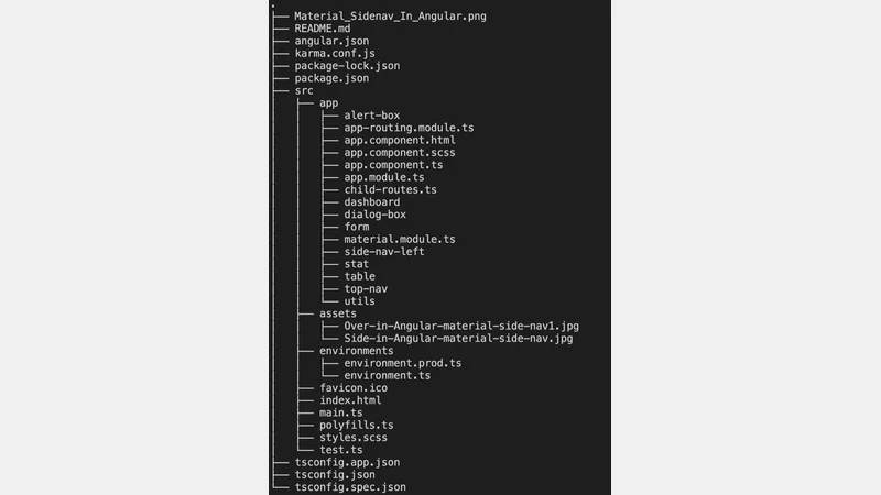 Project Structure
Conclusion
In the context of an Angular application, the integration of responsive tables becomes a seamless endeavor with the Angular Material module. This module provides a robust framework for creating dynamic and adaptable tables, ensuring a user-friendly and visually appealing presentation of information. By harnessing the capabilities of Angular Material, developers can enhance the data representation within their applications, offering users a more intuitive and engaging experience.
Comments
There are no comments yet.