Angular Material Sidenav: Theming Right Side Navbar
In this tutorial, we'll focus on enhancing the theme of our Angular Material app by adding a right-side navbar. Our goal is to incorporate color controller inputs for configuring themes. Initially, we'll construct the right-side navbar to house these color controller inputs and theme settings panel.
- Angular Material Right SideNav Overview
- Install NPM packages for Angular Material Right SideNav
- Create Angular material right Sidenav
- Update app.module.ts for Right Sidenav
- Create the Material Setting Button in app-component
- Configure Material Right Sidenav in app-component
- Create Settings Service for Material Right SideNav
- Update Angular Material right Sidenav
- Update global styles.scss file for Material SideNav
- File structure of Angular Material Right SideNav Example
- Conclusion
This tutorial marks the part 4 of the Angular Material tutorial series, specifically dedicated to theming. To simplify your starting point, I’ve already put together a basic template using Angular material. You can grab the template by cloning this git repository and begin your work from there. However, Make sure to update the starter template with the dashboard(part 2) and Angular material tables(part 3) as it will provide a solid foundation for your responsive Angular material project.
-
Part 1: How to create a responsive Angular material side nav(Already included in the starter template).
Angular Material Right SideNav Overview
By the conclusion of this tutorial, our Angular app will resemble the one demonstrated in this video. This serves as the tangible outcome of following the steps outlined in this guide. The purpose is to equip you with the skills to implement similar techniques in your own Angular applications. Through this tutorial, you’ll gain the ability to integrate these methods, allowing you to craft visually appealing and user-friendly web applications using Angular Material. The provided demo offers a practical showcase of what you can achieve by applying the concepts covered in this guide.
Install NPM packages for Angular Material Right SideNav
In this tutorial, we’ll incorporate two essential npm packages to enhance the functionality of our project. First up is the angular-material-css-vars library, accessible at this link. This library provides a set of APIs that enable the dynamic management of theme colors. It proves to be a valuable asset in our quest to create a visually appealing and customizable user interface.
The second npm package we’ll integrate is the Angular Material Color Picker. This component will serve as a user-friendly tool to gather primary, secondary, and accent colors as inputs from users. By utilizing this color picker, we add a layer of interactivity to our application, allowing users to personalize their experience.
To install these npm packages, execute the following commands within the root folder of your project. These commands ensure the addition of the required libraries to the npm_modules directory while simultaneously updating the package.json file with the necessary entries.
sudo npm i angular-material-css-vars --force
sudo npm i @angular-material-components/color-picker --force
- It’s important to exercise caution when using the
–forceflag with ng commands. While it can be a helpful tool, there’s a risk of breaking the project. Prior to running commands with the–forceflag, consider taking a backup of your existing code or commit any uncommitted changes to prevent any unintended complications.
Create Angular material right Sidenav
Now, we’ll create a right-side navbar for our Angular Material app, housing all the theme controller inputs. The visual representation of this component can be observed in the image below.
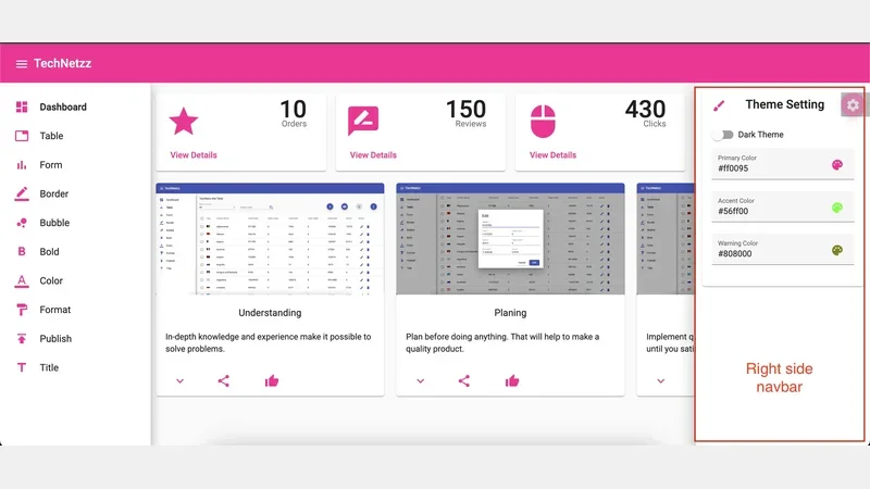 Theming Angular material app - Control Widgets
The primary objective is to consolidate all theme-related controls within this right-side navbar, providing a dedicated space for users to interact with and customize the app’s appearance.
To initiate the creation of this right-side navbar component, execute the following command in your terminal. This command ensures the automatic integration of the newly generated component into the app.module.ts file, streamlining the overall development process.
ng g c side-nav-right --module app.module.ts
By running this command, you’ll set the foundation for the right-side navbar, bringing us a step closer to establishing a user-friendly and organized layout for theme configuration in our Angular Material app.
Update app.module.ts for Right Sidenav
The next crucial step involves updating the app.module.ts file by incorporating the necessary imports and configurations. Having already installed the required packages in previous sections, it’s essential to understand that mere installation isn’t sufficient. We need to import these packages in the app.module.ts file and make some basic configurations. Once these adjustments are implemented, the app.module.ts file takes on the following structure.
import { NgModule } from '@angular/core';
import { BrowserModule } from '@angular/platform-browser';

import { AppRoutingModule } from './app-routing.module';
import { AppComponent } from './app.component';
import { BrowserAnimationsModule } from '@angular/platform-browser/animations';
import { SideNavClosedComponent } from './side-nav-left/side-nav-closed/side-nav-closed.component';
import { SideNavComponent } from './side-nav-left/side-nav/side-nav.component';
import { TopNavComponent } from './top-nav/top-nav.component';
import { FormComponent } from './form/form.component';
import { ReactiveFormsModule, FormsModule } from '@angular/forms';
import { MaterialModule } from './material.module';
import { DashboardComponent } from './dashboard/dashboard.component';
import { StatComponent } from './stat/stat.component';
import { FlexLayoutModule } from '@angular/flex-layout';
import { TableComponent } from './table/table.component';
import { DialogBoxComponent } from './dialog-box/dialog-box.component';
import { HttpClientModule } from '@angular/common/http';
import { AlertBoxComponent } from './alert-box/alert-box.component';
import { SideNavRightComponent } from './side-nav-right/side-nav-right.component';
import { MaterialCssVarsModule, MaterialCssVarsService } from 'angular-material-css-vars';
import { MAT_COLOR_FORMATS, NgxMatColorPickerModule, NGX_MAT_COLOR_FORMATS } from '@angular-material-components/color-picker';

@NgModule({
  declarations: [
    AppComponent,
    SideNavClosedComponent,
    SideNavComponent,
    TopNavComponent,
    FormComponent,
    DashboardComponent,
    StatComponent,
    TableComponent,
    DialogBoxComponent,
    AlertBoxComponent,
    SideNavRightComponent
  ],
  imports: [
    BrowserModule,
    AppRoutingModule,
    BrowserAnimationsModule,
    ReactiveFormsModule,
    MaterialModule,
    FlexLayoutModule,
    FormsModule,
    HttpClientModule,
    NgxMatColorPickerModule,
    MaterialCssVarsModule.forRoot({
      isAutoContrast: true,
      darkThemeClass: 'isDarkTheme',
      lightThemeClass: 'isLightTheme',
    })
  ],
  providers: [
    MaterialCssVarsService,
    { provide: MAT_COLOR_FORMATS, useValue: NGX_MAT_COLOR_FORMATS }
  ],
  bootstrap: [AppComponent]
})
export class AppModule { }
This updated configuration incorporates the newly installed packages, ensuring that our Angular Material app is well-equipped to handle the dynamic theme management and color picking functionalities. The organized structure of the app.module.ts file facilitates a clear overview of the integrated components and modules essential for the app’s seamless operation.
Create the Material Setting Button in app-component
To enable control over the right-side navbar, we’ll create a button that serves as a toggle switch. The button’s appearance and functionality are demonstrated in the image below.
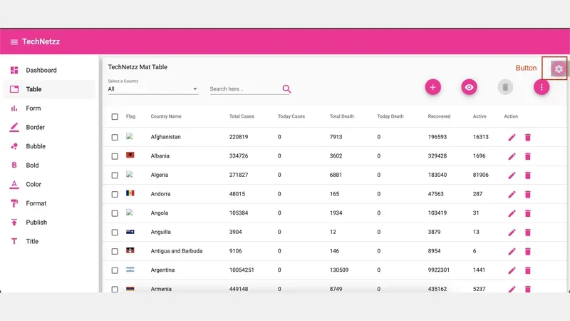 Theming Angular material - Settings Button
The HTML markup and SCSS styles for the settings button are outlined as follows.
<div class="setting-button-container">
  <button class="setting-btton" color="primary" mat-mini-fab (click)="rightSidenav.toggle()">
    <mat-icon>settings</mat-icon>
  </button>
</div>
.setting-btton {
 opacity: 0.5;
}
.setting-button-container {
 top: 80px;
 background-color: rgba(0, 0, 0, 0.3);
 width: 48px;
 right: 0;
 height: 40px;
 opacity: 0.9;
 padding: 0;
 z-index: 10;
 position: fixed;
 min-width: 48px;
 border-top-right-radius: 0;
 border-bottom-right-radius: 0;
}
The button is integrated into the app component shortly, positioned at the top-right corner with a distinctive appearance. When clicked, it triggers the toggle function for the right-side navbar, providing a user-friendly mechanism to control the display of the theme settings. The associated CSS styles enhance the button’s visual appeal and ensure its proper placement within the app’s interface. This settings button serves as a pivotal element in managing the accessibility and user interaction with the right-side navbar in our Angular Material app.
Configure Material Right Sidenav in app-component
The subsequent task involves configuring the right-side material navbar by setting up the side-nav-right component in the app-component. The side-nav-right component will house all the input fields necessary for theme configuration.
By implementing above steps, the app.component.html and app.component.scss files take on the following structure.
<div class="layout-container font-regular" mat-app-background>
  <app-top-nav (sideNavToggled)="onToolbarMenuToggle()"></app-top-nav>
  <div class="setting-button-container">
    <button class="setting-btton" color="primary" mat-mini-fab (click)="rightSidenav.toggle()">
      <mat-icon>settings</mat-icon>
    </button>
  </div>
  <mat-sidenav-container class="sidenav-container" [style.marginTop.px]="toolBarHeight" [hasBackdrop]="hasBackdrop">
    <mat-sidenav #snav position="start" disableClose="true" role="navigation" class="sidenav mat-elevation-z10"
      [mode]="sideNavMode" [opened]="sideNavDefaultOpened"
      [ngStyle]="{'width.px': isExpanded ? openedWidth :  closedWidth}">
      <app-side-nav *ngIf="showFullMenu; else elseBlock"></app-side-nav>
      <ng-template #elseBlock>
        <app-side-nav-closed></app-side-nav-closed>
      </ng-template>
    </mat-sidenav>
    <mat-sidenav #rightSidenav position="end">
      <app-side-nav-right></app-side-nav-right>
    </mat-sidenav>
    <mat-sidenav-content role="rigion" id="sidenav-content"
      [ngStyle]="{'margin-left.px': isExpanded && !isMobile ? openedWidth :  closedWidth}">
      <main class="main-container">
        <router-outlet></router-outlet>
      </main>
    </mat-sidenav-content>
  </mat-sidenav-container>
</div>
.layout-container {
  display: flex;
  flex-direction: column;
  position: absolute;
  top: 0;
  bottom: 0;
  left: 0;
  right: 0;
  .sidenav-container {
    flex: 1;
    .sidenav {
      padding: 8px;
      transition: width 200ms;
    }
    .main-container {
      padding: 8px;
    }
  }
}

#sidenav-content {
  transition: margin-left 200ms;
}
.setting-btton {
  opacity: 0.5;
}
.setting-button-container {
  top: 80px;
  background-color: rgba(0, 0, 0, 0.3);
  width: 48px;
  right: 0;
  height: 40px;
  opacity: 0.9;
  padding: 0;
  z-index: 10;
  position: fixed;
  min-width: 48px;
  border-top-right-radius: 0;
  border-bottom-right-radius: 0;
}
With these configurations, we establish a structured layout for the right-side material navbar, providing a dedicated space for theme configuration input fields. The HTML and CSS code ensures a well-organized and visually appealing interface for users to interact with the app’s settings.
Create Settings Service for Material Right SideNav
Now, let’s proceed to creating an Angular service responsible for managing key theme configurations. The service will be designed to handle the theme type (Dark or Light), primary color, accent color, and warning color. Furthermore, it will play a crucial role in persisting these configurations by storing them in the local storage of the browser.
Upon loading the application, the setting service will read these configurations from the local storage and apply them throughout the Angular application, leveraging the capabilities of the angular-material-css-vars library.
To create this indispensable service, execute the following command, which will generate the setting service in the utils directory:
ng g s utils/setting
Within the setting service, you’ll find default configurations for the theme. These configurations include the theme type (initially set as Dark), primary color, accent color, and warning color. It’s important to note that you have the flexibility to adjust these configurations based on your preferences.
Throughout the service, inline comments have been provided to offer clarity on the functionality of each function. These comments serve as a guide, explaining the purpose and actions performed by specific sections of the setting service code.
By creating this Angular service, we establish a robust mechanism for managing and persisting theme configurations, fostering a more dynamic and user-friendly experience within our Angular application.
Once we add all the functions, the setting.service.ts looks like this.
import { Injectable } from '@angular/core';
import { MaterialCssVarsService } from 'angular-material-css-vars';
import { Color } from '@angular-material-components/color-picker';

export const defaultTheme = {
  isDarktheme: false,
  primaryColor: "#065037",
  accentColor: "#4a3cb3",
  warningColor: "#b33c3c"
}

@Injectable({
  providedIn: 'root'
})
export class SettingService {

  // key for local storage
  key = 'userConfigTechNetzz';
  isDarkTheme!: boolean;
  primaryColor!: string;
  accentColor!: string;
  warningColor!: string;

  constructor(public materialCssVarsService: MaterialCssVarsService) {
   this.setThemeConfig();
  }

  /*
  this function is being called when
  the application is started
  */
  setThemeConfig(): void {

    /*
    read already selected theme configs from
    local storage
    */
    let selectedThemeConfig = JSON.parse(localStorage.getItem(this.key) || '{}');
    if (selectedThemeConfig != null) {
      this.setThemeVars(selectedThemeConfig);
    } else {
    /*
    set default theme-configuration if
    there is nothing in the local storage
    */
      this.setThemeVars(defaultTheme);
    }
    this.setTheme();
  }

  /*
  func to set theme and default colors
  this will just update global theme-variables
  */
  setThemeVars(config: any): void {
    console.log(config)
    this.isDarkTheme = config.isDarktheme;
    this.primaryColor = config.primaryColor;
    this.accentColor = config.accentColor;
    this.warningColor = config.warningColor;
  }

  /*
  func to set theme configs in materialCssVarsService
  */
  setTheme(): void {
    this.materialCssVarsService.setDarkTheme(this.isDarkTheme);
    this.materialCssVarsService.setPrimaryColor(this.primaryColor);
    this.materialCssVarsService.setAccentColor(this.accentColor);
    this.materialCssVarsService.setWarnColor(this.warningColor);
  }

  /*
  func to set theme
  */
  getThemeType(): boolean {
    return this.isDarkTheme;
  }

  /*
  func to set primary color
  */
  getPrimaryColor(): Color {
    return this.getRGBA(this.primaryColor);
  }

  /*
  func to set accent color
  */
  getAccentColor(): Color {
    return this.getRGBA(this.accentColor);
  }

  /*
  func to set warning color
  */
  getWarningColor(): Color {
    return this.getRGBA(this.warningColor);
  }

  /*
  func to set theme and store
  configs in local storage
  */
  setThemeType(isDark: boolean): void {
    this.isDarkTheme = isDark;
    this.setTheme();
    this.saveConfg();
  }

  /*
   func to set primary color and store
   configs in local storage
  */
  setPrimaryColor(color: string): void {
    console.log(color);
    this.primaryColor = color
    this.setTheme();
    this.saveConfg();
  }

  /*
  func to set accent color and store
  configs in local storage
  */
  setAccentColor(color: string): void {
    this.accentColor = color;
    this.setTheme();
    this.saveConfg();
  }

  /*
  func to set warning color and store
  configs in local storage
  */
  setWarningColor(color: string): void {
    this.warningColor = color;
    this.setTheme();
    this.saveConfg();
  }

  /*
  func to get RGBA version of a given color
  */
  getRGBA(color: string): any {
    let plateColor = this.materialCssVarsService.getPaletteForColor(color)[5].color;
    return new Color(plateColor.r, plateColor.g, plateColor.b)
  }

  /*
  func to store configs in
  local storage
  */
  saveConfg(): void {
    let userConfig = {
      isDarktheme: this.isDarkTheme,
      primaryColor: this.primaryColor,
      accentColor: this.accentColor,
      warningColor: this.warningColor,
    }
    localStorage.setItem(this.key, JSON.stringify(userConfig));
  }
}
Update Angular Material right Sidenav
We’ve created the side-nav-right component to host essential theme configuration input fields. Within this component, we’ve incorporated the following features.
- An Angular Material toggle button facilitating the dynamic switch between dark and light themes.
- Color selector input fields allowing users to choose their preferred primary, accent, and warning colors.
As users interact with these input fields and select colors, the chosen color schemes dynamically propagate throughout the application, thanks to the integration of the angular-material-css-vars library. This ensures that the selected colors reflect across different components and elements within the Angular application.
The completed right-side navbar component, implemented in TypeScript, orchestrates the interaction between the input fields and the setting service. The setting service, in turn, handles the storage and retrieval of theme configurations, including the theme type, primary color, accent color, and warning color. During the initialization phase, default configurations are set in the input fields using form controllers.
To provide a user-friendly interface, the component includes a visually appealing card with a brush icon, signifying theme settings. The card comprises a list of theme-related options, such as the dark theme toggle and color selectors for primary, accent, and warning colors. The CSS styles ensure a neat layout with appropriate margins for an organized appearance.
By implementing these updates, the Angular Material right-side navbar becomes an intuitive hub for users to customize the visual aspects of the application, contributing to a more personalized and engaging user experience.
This is the completed right-side nav bar component.
import { Component, OnInit } from '@angular/core';
import { SettingService } from '../utils/setting.service';
import { FormControl, AbstractControl } from '@angular/forms';

@Component({
  selector: 'app-side-nav-right',
  templateUrl: './side-nav-right.component.html',
  styleUrls: ['./side-nav-right.component.scss']
})
export class SideNavRightComponent implements OnInit {

  /*
  initialize form controls for theme settings
  */
  isDarktheme!: boolean;
  primaryC!: AbstractControl;
  accentC!: AbstractControl;
  warningC!: AbstractControl;


  constructor(private settingService: SettingService ) { }

  ngOnInit(): void {
    /*
    set up default configs in
    input fields using form controllers
    */
    this.isDarktheme = this.settingService.getThemeType();
    this.primaryC = new FormControl(this.settingService.getPrimaryColor());
    this.accentC = new FormControl(this.settingService.getAccentColor());
    this.warningC = new FormControl(this.settingService.getWarningColor());
  }

  /*
  set selected theme ie dark or light
  */
  setThemeType(): void {
    this.settingService.setThemeType(this.isDarktheme);
  }

  /*
  set selected primary color
  */
  setPrimaryColor(): void {
    this.settingService.setPrimaryColor(this.primaryC.value.rgba);
  }

  /*
  set selected accent color
  */
  setAccentColor(): void {
    this.settingService.setAccentColor(this.accentC.value.rgba);
  }

  /*
  set selected warning color
  */
  setWarningColor(): void {
    this.settingService.setWarningColor(this.warningC.value.rgba);
  }

}
<div class="mtrbl10">
  <mat-card>
    <mat-card-header>
      <div mat-card-avatar>
        <mat-icon color="primary" class="sidenav-icon">brush</mat-icon>
      </div>
      <mat-card-title>Theme Setting</mat-card-title>
    </mat-card-header>
    <mat-card-content>

      <mat-nav-list>

        <div mat-list-item>
          <div class="mb10">
            <mat-slide-toggle matInput (change)="setThemeType()" [(ngModel)]="isDarktheme">Dark Theme</mat-slide-toggle>
          </div>
        </div>

        <div mat-list-item>
          <mat-form-field appearance="fill">
            <mat-label>Primary Color</mat-label>
            <input matInput [ngxMatColorPicker]="pickerPrimary" (colorChange)="setPrimaryColor()"
              [formControl]="primaryC">
            <ngx-mat-color-toggle matSuffix [for]="pickerPrimary"></ngx-mat-color-toggle>
            <ngx-mat-color-picker #pickerPrimary></ngx-mat-color-picker>
          </mat-form-field>
        </div>

        <div mat-list-item>
          <mat-form-field appearance="fill">
            <mat-label>Accent Color</mat-label>
            <input matInput [ngxMatColorPicker]="pickerAccent" (colorChange)="setAccentColor()" [formControl]="accentC">
            <ngx-mat-color-toggle matSuffix [for]="pickerAccent"></ngx-mat-color-toggle>
            <ngx-mat-color-picker #pickerAccent></ngx-mat-color-picker>
          </mat-form-field>
        </div>

        <div mat-list-item>
          <mat-form-field appearance="fill">
            <mat-label>Warning Color</mat-label>
            <input matInput [ngxMatColorPicker]="pickerWarning" (colorChange)="setWarningColor()"
              [formControl]="warningC">
            <ngx-mat-color-toggle matSuffix [for]="pickerWarning"></ngx-mat-color-toggle>
            <ngx-mat-color-picker #pickerWarning></ngx-mat-color-picker>
          </mat-form-field>
        </div>

      </mat-nav-list>

    </mat-card-content>
  </mat-card>
</div>
.mtrbl10 {
  margin: 10px;
}

.mb10 {
  margin-bottom: 10px;
}
Update global styles.scss file for Material SideNav
In the final step of this tutorial, we need to update the global styles.scss file to incorporate the necessary SCSS mixins. Without these updates, any changes made to colors in the theme settings won’t be reflected in the application. Once the configurations are added, the styles.scss file should resemble the following:
/* You can add global styles to this file, and also import other style files */
@use 'angular-material-css-vars' as mat-css-vars;
@include mat-css-vars.init-material-css-vars(
) using($mat-css-theme) {};

html, body { height: 100%; }
body { margin: 0; font-family: Roboto, "Helvetica Neue", sans-serif; }
This modification ensures that the global styles file is now equipped with the required SCSS mixins and configurations. The mat-css-vars.init-material-css-vars mixin, along with the $mat-css-theme variable, enables the integration of dynamic color changes throughout the application based on the selected theme configurations.
By updating the global styles.scss file in this manner, we ensure that the theme customization options provided in the right-side navbar are effectively applied across the entire application.
File structure of Angular Material Right SideNav Example
The final project exhibits a clear and organized file structure, showcasing a thoughtful arrangement of components and services. All components reside neatly within the ‘app’ directory, forming the core elements of the application. Meanwhile, essential services are centralized in the ‘app/utils’ directory, emphasizing a modular and systematic approach.
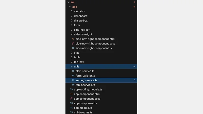 Project Structure
Conclusion
In conclusion, enhancing the visual appeal of your Angular applications through theming significantly contributes to an improved user experience. This tutorial has guided you through the process of customizing the theme of your Angular Material applications, empowering users to personalize their profiles by choosing colors that resonate with their preferences. The utilization of the angular-material-css-vars library has proven to be an efficient method for dynamically altering theme colors, offering a seamless and responsive means of implementing these visual changes. By following the steps outlined in this tutorial, you now have the tools to create a more engaging and user-friendly environment within your Angular applications.
Comments
There are no comments yet.